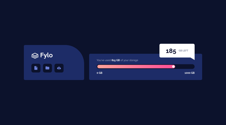
Design comparison
Solution retrospective
I had a bit of trouble formatting my code and refining it, and I am sure there are simpler ways to do somethings. I learnt a lot about using positioning, and it was a good way to practice flexbox. I would love to hear if there are better ways to do the things I did or simpler cleaner one. Any advice would be appreciated
Thanks to frontend mentor for providing us with such wonderful projects to practice with for free. :)
aDev
Community feedback
- @elaineleungPosted about 2 years ago
Hi aDev, great work on this very first challenge! I tried to look at your repo, but firstly the link doesn't seem to be working, and when I did find your repo on your GitHub profile, I couldn't really find the component files. Are they in the .gitignore? I'm really not sure what's happening, but in any case it would help if I could see how your wrote your code. Anyway, I think using Vercel for deployment is good for these projects, and it looks like that's what you're currently using. Are you experiencing some issues with it?
As for feedback on your work, I think the only comments I can make are these ones:
- When using buttons for the actions, you can add some text and then hide the text with a
visually-hidden
class, otherwise you'll have issues in your report when the button has no text. - Things look fairly fixed right now, as you're using fixed widths and so it's not really responsive. See whether you can use responsive properties instead.
- It also seems like you don't have a mobile version yet! Try adding one, and I also suggest to try a mobile-first approach where you start building the mobile version first and then use media queries for the desktop version.
I wish I can see what's going on the CSS and Next.js but I just can't find the files sadly. Anyway, this is good enough for now, and once again, well done in building this solution!
Marked as helpful1@Senkuu-MidoriyaPosted about 2 years agoHi @elaineleung, thank you so much for taking time out of your day to give me feedback on my first project. As for the github repo, this was my first time trying to create a proper repo so I apologize for any inconvenience. I really appreciate the feedback you gave me and will make sure to use it in my other project or when I refactor my code, this type of advice is invaluable to me begin someone who it just starting out learning web dev, and getting advice from and experienced person like yourself, if very valuable to me.
Thanks you taking the time out of your day to share the advice you had for me and feedback, aDev
0 - When using buttons for the actions, you can add some text and then hide the text with a
- @Senkuu-MidoriyaPosted about 2 years ago
I would love any advice on how to deploy my website with a better free hosting service, or related to the code and if there are simpler ways to do things, or ways that I should be doing things. I am still a newbie and have not gotten into more advanced things like accessibility, however I plan on learning that very soon due to the fact that I want anyone to be able to enjoy my webpages.😁
Thanks to anyone who leaves feedback, aDev
1
Please log in to post a comment
Log in with GitHubJoin our Discord community
Join thousands of Frontend Mentor community members taking the challenges, sharing resources, helping each other, and chatting about all things front-end!
Join our Discord