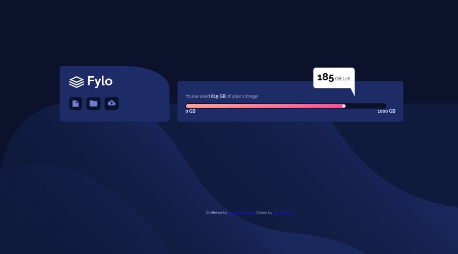
Not Found
Not Found
Not Found
Not Found
Not Found
Not Found
Not Found
Not Found
Not Found
Not Found
Not Found
Not Found
Not Found
Not Found
Not Found
Not Found
Not Found
Not Found
Not Found
Not Found

Submitted

Fylo data Storage with html and css

Soham 100

@sommmmore

Desktop design screenshot for the Fylo data storage component coding challenge

This is a solution for...

  • HTML
  • CSS
2junior
View challenge

Design comparison


SolutionDesign

Solution retrospective


How could I make it more responsive ? I am not so good with the media queries. And also with varying widths, it gave some minor issues. If you could review the code and help me improve, I would be grateful. Have a nice day ! :)

Community feedback

@JanWu100

Posted

Hello there, It looks great :) I have a tip for you regarding positioning the .storage-left popup. You have set position:relative to .storage, and then position: absolute to .storage-left which is very good.

In order to make your popup placed exactly as in the designs:

Desktop view: Instead of counting distance from left (left: 60vw). Just change it to right: <use padding of your storage element here>. So in your case right: 25px. This will make it stick to the right side instead of swiming left and right on different screen-sizes.

Mobile view: I see you try to center this element with static value - "left: 22vw;". The trick to do it (and I use it for every project) is to set left: 50% - which will make you element start exactly in the middle. And then on that element (.storage-left) apply "transform: translateX(-50%)" which will move this element to its exact middle :). So for the vertical position you can do the same = top: 100%, transition: translateY(-50%).

Also your .bar have width of 95%, shouldnt that be 100%? ;), As a last tip, you have "display: grid" repeated in media querry, if you are not changing property, you dont have to repeat it.

I hope that helps a bit, and that It will make relative positioning a bit easier for you for the future :). Cheers!

Marked as helpful

0

Soham 100

@sommmmore

Posted

@JanWu100 Jan, your suggestions were very helpful :)) I tried them out. Thanks for taking the time, I am really grateful !

0
Soham 100

@sommmmore

Posted

@JanWu100 Also , Jan, what would be the ideal pixel size for the mobile version? As in, for this challenge, I have taken @media(max-width) almost around 650px. Is there any standard value for that ? Also, if not, what are the things that we should consider before choosing that value ?

0

@JanWu100

Posted

@sommmmore I am happy I could have helped :). I am a beginner myself though so I have writen about things I am most confident about :). As for this challenge I have only added one breakpoint:

I have figured the minimal combined width I want my components on desktop view to have, and made it a rwd breakpoint. I also used max-width for elements for mobile so they are not stretched over 440px as I personally found them to look less attractive when too wide.

As for the general. Very common breakpoints (according to statcounter website) are: 1920×1080 1366×768 360×640 414×896 1536×864 375×667. From what I know when defining media querries you should consider the pixelwidth of devices that will be mostly used to view your website. I think that people do that using tools like google analytics etc. But take it with the grain of salt cuz as I said I am also new to all this :).

As a bonus tips I can also point out 2 things that came to me when inspecting your site that slightly differ from the original design:

Your <main> is set to 75% width, but you dont use max-width for it so on higher resolution screens your design will be very stretched, I believe that adding max-width to the <main> element will make it closer to the original. I personally went with 940px i think.

Also your top-right-border-radius is set to % value for left card. It will make it stretch when nav element is getting wider. Look at the original design, even thou left div is not a square but a wide rectangle, the border-radius is nice nad round. I think you can fix it with setting value to static value (px/rem).

PS: I really liked your implementation of arrow ::after the .storage-left element. Mine is a lot worse I think and I have learned something from your solution as well :). Good luck!

Marked as helpful

0
Soham 100

@sommmmore

Posted

@JanWu100 Thank you Jan for being helpful as always !!! :))

0

Please log in to post a comment

Log in with GitHub
Discord logo

Join our Discord community

Join thousands of Frontend Mentor community members taking the challenges, sharing resources, helping each other, and chatting about all things front-end!

Join our Discord