Fylo Data Storage VANILLA CSS (Custom Design + CSS Animations)
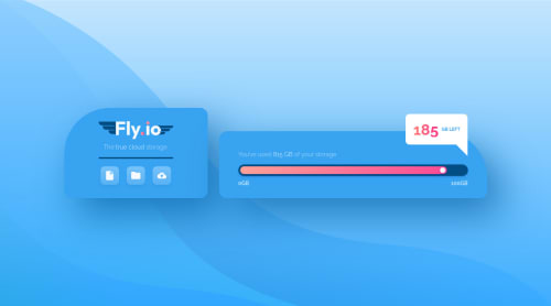
Design comparison
Solution retrospective
👾 Hello, Frontend Mentor coding community. This is my solution for the Fylo Data Storage Component.
This challenge was really challenging, was really tricky to create the pop up and position some elements. Was really fun to create the logo and customize the design, I am happy with the design output but not with the code, once I finish the remaining HTML/CSS challenges I'll focus on it!
🎨 I added some custom features:
- 👨🔬 Custom UI Design + Logo.
- 🧚♀️ CSS Animations
🍚Follow me in my journey to finish all HTML/CSS
only challenges (Only 3 missing)! Gotta Catch ’Em All
Ill be happy to hear any feedback and advice!
Community feedback
- @SameerJS6Posted about 2 years ago
I loved the color scheme and Gradient in it.!!.. But a minor change (i.e its 1000GB or 1TB, not 100GB)...
Marked as helpful2 - @AdrianoEscarabotePosted about 2 years ago
Opa lucas, de boa?
Bom podemos fazer esse efeito de uma forma bem simples!
Primeiro, observei que você já fez algo bem parecido no começo, parar a animação ficar repetindo podemos fazer assim:
.inner-bar { -webkit-animation: loadingBar 1.2s ease-in 1 .5s infinite; animation: loadingBar 4s ease infinite; transition: all ease 2s }
A animação ficará se repetindo, você pode personalizar o tamanho que ela cresce e a velocidade pelo keyframes!
Parabéns pelo desafio, esse você mandou muito bem na personalização!
Marked as helpful0 - @NathandcwendyPosted about 2 years ago
Wow!!! You did very good on this one man. That logo design looks amazing.
I really like your solution. Weldone! 👏🚀🥼👨🔬🎱
1@correlucasPosted about 2 years ago@Nathandcwendy Thank you Dike, I appreciate that =)
0 - @sm7654Posted about 2 years ago
Hi, im currently learning css and html.
i saw your work and im amazed, i wonder if you can tell me how did you learn to code like that.
Did you take a course of css and html or you learned alone? if you took a course do you have any suggestions of courses that i can take? how much experience do you have in web development?
thanks.
1@correlucasPosted about 2 years ago@sm7654 Hey, thank you for the words! I am a newbie too, but I can say you that all I've learned was by doing projects here and giving some customization for my challenges. Before Frontend Mentor I did a basic course of html/css, but what makes me really learn
flexbox
andgrid
was by doing the challenges here. A great source for css content is this channel in youtubehttps://www.youtube.com/kepowob
Kevin Powell.Try to do all newbies challenges, you'll see a great improvement after you finish 5/10. Try that an comeback here if it worked.
I'm studying Frontend development since march 2022 but I've already some knowledge in graphic design/ui.
Keep it up =)
1 - @bighehaPosted about 2 years ago
Im amazed at your consistency with these challanges. Seems to me you are ready to pursue a job at this point.
1@correlucasPosted about 2 years ago@bigheha Hello Lhor, not yet, I have to reach some goals with Javascript and some framework yet But the challenges definitely help me to improve my coding and design skills. Thank you bro 😁
0 - @rohanagroyaPosted about 2 years ago
why you not used Dark color which is in the real design ?
1@correlucasPosted about 2 years ago@rohanagroya Hey Ronan, because I like to customize my challenges and do more than what is required, sometimes changing the design, adding animation and features. But its just a personal choice, nothing special.
1 - @sabbircoder07Posted about 2 years ago
Looking not good as well color not match website's personality.
1@correlucasPosted about 2 years ago@sabbircoder07 Thank you Sabbir for your time, knowledge and for the enlightening comment. Help me to improve, can you please give me more details why it doesn't look good and which kind of colors could match the website personality? For example can you point me a color palette to use?
What you think about the website dropbox? They use good colors?
https://www.dropbox.com/
Kind regards.
0 - @Tunde-webdevPosted about 2 years ago
you are a boss!!!
can you please explain how you went about the 185GB left pop up and how you animated the box pointing to the end of range??? how did you put it in your code, I'm a beginner, just being curious
1@correlucasPosted about 2 years ago@Tunde-webdev Hello Tunde! To positition the pop-up I've used
position relative/absolute right/bottom
you can inspect the pop up to see the code. About the animations I've used the css animation tools and @keyframes.To understand better the pop-up position you can check this tutorial
https://youtu.be/Yv7UMWbZCVI
1@Clement1kalu-okerekePosted about 2 years ago@correlucas What Css animation tools did you use
0@Clement1kalu-okerekePosted about 2 years ago@correlucas What Css animation tools did you use
0@Tunde-webdevPosted about 2 years ago@correlucas one more thing is getting me confused 😔😪
I checked your code & you didn't make use of the <input "range"... How did you come about the bar and the ball in it??... I'm sorry if my questions are getting too much
0@Tunde-webdevPosted about 2 years ago@correlucas one more thing is getting me confused 😔😪
I checked your code & you didn't make use of the <input "range"... How did you come about the bar and the ball in it??... I'm sorry if my questions are getting too much
0@correlucasPosted about 2 years ago@Clement1kalu-okereke You can use this video as a reference
https://www.youtube.com/watch?v=YszONjKpgg4
0@correlucasPosted about 2 years ago@Tunde-webdev I've created an empty div with a class and give it a size with padding and make the border rounded to become a circle, approx
padding: 10px / border-radius: 50%
. By the way you can ever check the code in my repository, remember to check the code in the filestyle.css
instead of the minified version for a better reading.0
Please log in to post a comment
Log in with GitHubJoin our Discord community
Join thousands of Frontend Mentor community members taking the challenges, sharing resources, helping each other, and chatting about all things front-end!
Join our Discord