Submitted over 4 years agoA solution to the Fylo data storage component challenge
Fylo Data Storage HTML, CSS, Flex
@Tom2612

Solution retrospective
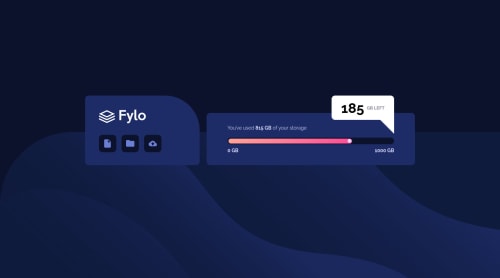
Any tips on the triangle under the 185GB left layover would be great, had trouble thinking how to do this. Really enjoyed getting through this!
Code
Loading...
Please log in to post a comment
Log in with GitHubCommunity feedback
No feedback yet. Be the first to give feedback on Tom's solution.
Join our Discord community
Join thousands of Frontend Mentor community members taking the challenges, sharing resources, helping each other, and chatting about all things front-end!
Join our Discord