Design comparison
SolutionDesign
Solution retrospective
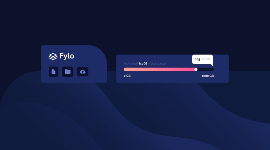
Hello ! Here is my third challenge. I was wondering if using "margin" is a good way to place the elements ? I guess no but i don't know how to do it, for example to center the two divs. I know my solution isn't responsive like it doesn't fit in a phone screen ( is responsive the right terms for that issue ?).
Any feedbacks would be great ! :)
Community feedback
- @AdrianoEscarabotePosted about 2 years ago
Hi Benjamin, how are you?
I really liked the result of your project, but I have some tips that I think you will enjoy:
to improve the design of the page, you can put the
background imageof thefooteron the body!body { background: url("image") hsla (100% ,5% , 0%); background-size: 100% 50vmin; background-position: bottom; }The rest is great!
I hope it helps... 👍
Marked as helpful1
Please log in to post a comment
Log in with GitHubJoin our Discord community
Join thousands of Frontend Mentor community members taking the challenges, sharing resources, helping each other, and chatting about all things front-end!
Join our Discord
