Design comparison
Solution retrospective
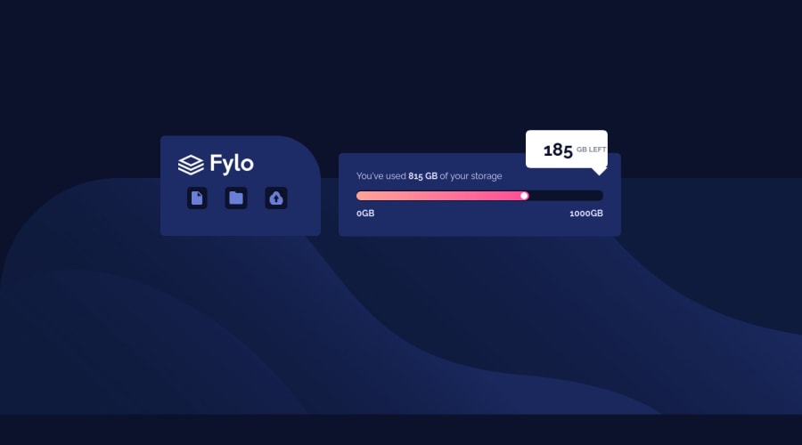
The comment arrow was a little problem for me and this is my first time using media queries and it really gave me a headache views and suggestions are welcome
Community feedback
- @elaineleungPosted over 2 years ago
Hi Agyemang, good job putting this together! For the triangle with the
::afterpseudo element, instead of having justborder: solid transparent, try specifying the sides, like this:.grid-item-3::after { top: 98%; right: 0; // remove left border-left: solid transparent; border-top: solid white; // rest of your code }Also, change the border-radius in
.grid-item-3toborder-radius: 8px 8px 0 8px;, which should give you that sharp corner instead of a rounded one.With the media query, I'd choose a much higher breakpoint since right now when the layout changes, the sides are cut off. Also, there appears to be some overflow going on, and I think it may have to do with the large margins you're using (such as in
.grid-item-3) to do positioning. I would actually suggest not having.grid-item-3as a grid element but to have that as a child of.grid-item-2instead, and I'd useposition: absoluteinstead of using things likemargin-left: 21rem, which is what I think is causing things to be pushed off to the right side of the screen.Hope this helps you out!
0
Please log in to post a comment
Log in with GitHubJoin our Discord community
Join thousands of Frontend Mentor community members taking the challenges, sharing resources, helping each other, and chatting about all things front-end!
Join our Discord
