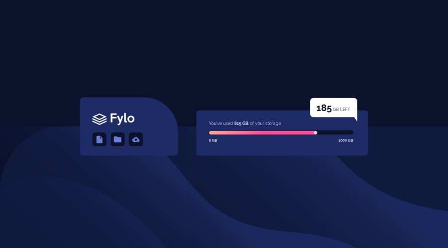
Design comparison
Solution retrospective
Any feedback would be greatly appreciated! A couple things I know I didn't do properly: making it responsive so that as the window sizes up & down the website behaves accordingly. The spacing is all correct on my browser but as soon as the window is made smaller, the boxes begin to squish together. I think my @media query is also not done correctly.
Community feedback
- @shashiloPosted over 4 years ago
You did a good job here Shylie. At first glance, the design elements match up besides spacing and responsiveness. But I did find other coding improvements that you can make:
- You
<main>
should not use a percentage for it's width. This affects the overall fluidity of the project. This is one of your responsiveness issues. I'd set this to amax-width: 920px;
on desktop and anything lower can be 100% with padding on the sides. - Try not to use a width greater than 100%. This will really mess with your DOM elements in multiple browsers. The
.container
is set to 120% right now. - Use sequential headings (h1, h2, h3, etc.).
- If you use the dev tools in the browser and hover over
.popup
and it's child DOM elements, the box-model for them are inconsistent. .popup has percentage height, width, positioning, etc. When you work with percentages, it makes it difficult to be pixel perfect and responsiveness. - For the bubble, look into using it as a pseudo element.
- Remove all the flex styles from
.circle
and addjustify-contents: flex-end;
to it's parent.gradient
. This will accomplish the same alignment with less code. - The naming of your classnames can improve as well. Instead of naming them left, right, bar, circle, come on with grouped naming conventing using BEM.
- Mobile needs some work. Many elements are not in the right places. One thing that will help you is if you build your DOM
mobile first
. Meaning, setup your DOM elements to stack according to the mobile design. Then you modify the tablet and desktop views to match those designs. It's easier to gracefully enhance the DOM starting from the mobile view.
I know this is a lot, but I'm in the slack channel too if you need some clarification on the items I listed.
0 - You
Please log in to post a comment
Log in with GitHubJoin our Discord community
Join thousands of Frontend Mentor community members taking the challenges, sharing resources, helping each other, and chatting about all things front-end!
Join our Discord