Submitted over 2 years ago
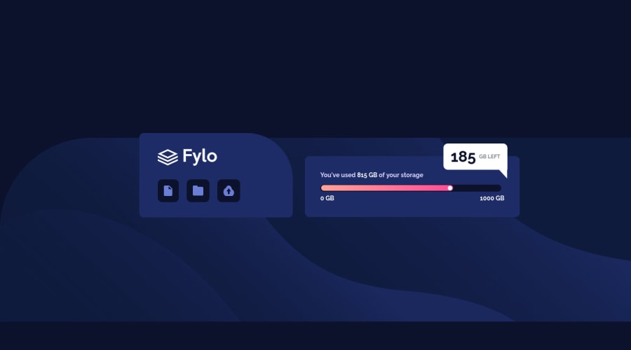
Fylo Data storage component using Css flexbox
#accessibility#materialize-css#sass/scss#tailwind-css
@Khlez
Design comparison
SolutionDesign
Solution retrospective
Hello everyone, I am still starting out and I will appreciate it you take out time to look at my work. This challenge was kind of tough especially with the shapes I had to make. Some work in full screen but when set to other viewports , it goes out of the allignment.
I will like feedback and tips to improve on that and also better ways to make shapes.
Community feedback
Please log in to post a comment
Log in with GitHubJoin our Discord community
Join thousands of Frontend Mentor community members taking the challenges, sharing resources, helping each other, and chatting about all things front-end!
Join our Discord
