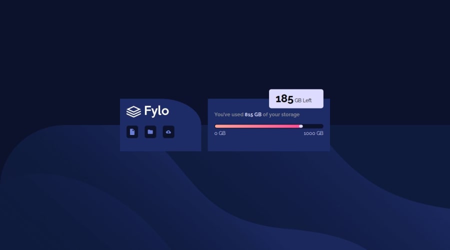
Design comparison
SolutionDesign
Solution retrospective
What are you most proud of, and what would you do differently next time?
i started to feel comfortable a little bit with the design
What challenges did you encounter, and how did you overcome them?setting up icon sizes equally
set up the white arrow
What specific areas of your project would you like help with?I want to know where is the bad practice in my code
is the layout and the way of using CSS variables good
how to make the arrow in the desktop version
Community feedback
Please log in to post a comment
Log in with GitHubJoin our Discord community
Join thousands of Frontend Mentor community members taking the challenges, sharing resources, helping each other, and chatting about all things front-end!
Join our Discord
