Fylo data storage component solution with HTML and CSS
Design comparison
Solution retrospective
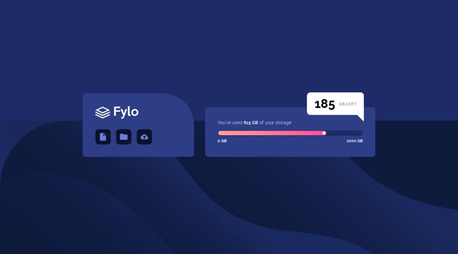
A few questions about this challenge: (1) Are there other common ways to make such a speech bubble, besides using borders? (2) Setting the background-color property in the parent completely covers images applied to the child elements. Is there a way to settle that?
Community feedback
- @c-healeyPosted almost 5 years ago
Your desktop layout is perfect. For the bubble, I googled 'chat bubble' and modified the example code I found. I've always seen bubbles, arrows etc implemented with a psuedo class. FWIW this is how I implemented the status bubble.
.status-bubble { position: absolute; top: 80%; right: 50%; transform: translateX(50%); background: white; border-radius: 0.4em; color: var(--color-very-dark-blue); padding: 1rem 2rem; }
.status-bubble::after { content: ""; position: absolute; bottom: 0; right: 0; width: 0; height: 0; border: 10px solid transparent; border-top-color: white; border-bottom: 0; border-right: 0; margin-bottom: -10px; visibility: hidden; }
And the media query for desktop @media (min-width: 768px) { .status-bubble { position: absolute; top: -30%; right: 0; transform: translateX(-30%); border-bottom-right-radius: 0; } .status-bubble::after { visibility: visible; } }
1
Please log in to post a comment
Log in with GitHubJoin our Discord community
Join thousands of Frontend Mentor community members taking the challenges, sharing resources, helping each other, and chatting about all things front-end!
Join our Discord
