Design comparison
Solution retrospective
Hello guys ! another challenge completed today :D
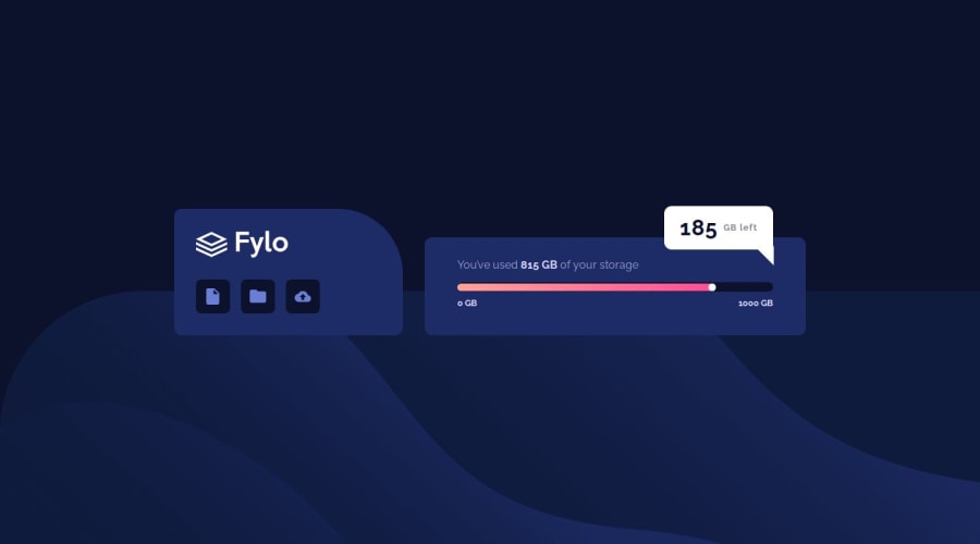
i need your opinion about the input range style !
hope u guys like my work and i will see you in the next one ! Feedbacks are appreciated
Community feedback
- @danielmrz-devPosted 9 months ago
Hello @eldon6219!
Your solution looks great!
As someone who has done a similar solution I understand the hardships!
It looks very cool but be careful with browser support when it comes to input ranges.
For example if you view your solution in Firefox the gradient doesn't exist and the slider thumb is not circular.
Marked as helpful1@eldon6219Posted 9 months agoHello @danielmrz-dev !
indeed it was hard , it was my first time styling an input range and i learned alot of new things doing it like styling the slider and the thumb .
i didn't consider the other browser because i was focusing on the new information i just learned and thank you for making me notice it and i will update it pretty soon <3
thank you so much for your feedback and if there anything else you notice i would appreciate your help
0 - @petritnurediniPosted 9 months ago
Congratulations on completing your Fylo Data Storage Component project! It's great to see your hard work and dedication. Here are a few suggestions to improve your project:
-
HTML Structure and Accessibility:
- In the
<section class="heading">
, it's recommended to provide analt
attribute for the images, even if it's just an empty string (alt=""
) for decorative images. This enhances accessibility. - Consider using more semantic HTML elements. For instance, the range input for storage could be wrapped in a
<fieldset>
with a<legend>
to better describe its purpose.
- In the
-
CSS Styling and Responsiveness:
- In your CSS, there are instances of
appearance: none;
and--webkit-apperance:none;
. The latter seems to be a typo. Ensure correct spelling for CSS properties for consistent browser rendering. - For better maintainability, consider organizing your CSS properties consistently (e.g., positioning, box-model, typography). Tools like CSSComb can help automate this.
- In your CSS, there are instances of
-
Code Cleanliness and Comments:
- There are commented-out HTML elements at the bottom of your HTML file. It's best practice to remove unused code to keep your codebase clean and readable.
- Good job on commenting your CSS sections! Consider also adding brief comments in your HTML for major sections, aiding in readability and maintainability.
Learning Resources:
- For better HTML and Accessibility practices: MDN Web Docs - HTML elements reference
- For CSS organization: CSSComb
- On writing clean code: Clean Code principles
Keep up the fantastic work! Each project you complete solidifies your skills and lays the foundation for more complex and exciting challenges. Stay curious and continue pushing your limits!
Marked as helpful0@eldon6219Posted 9 months agoHello @petritnuredini !
thank you for your kind words <3
i was one of the guys that didn't use any semantic elements always counted on divs but when i came here i learned more about them yet still
<fieldset>
and<legend>
are new elements for me and i thank you for that new tip you taught me todayas for the comments i fixed it i never leave unused codes in my files but for it seems that i forgot this time :D thank you for making me observe it will add more comments in the HTML section aswell
again thank you for your kinds and pushing words and i hope u like my future work and for your amazing feedback <3
0 -
Please log in to post a comment
Log in with GitHubJoin our Discord community
Join thousands of Frontend Mentor community members taking the challenges, sharing resources, helping each other, and chatting about all things front-end!
Join our Discord