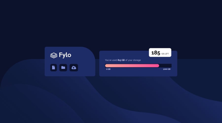
Design comparison
Solution retrospective
I would really appreciate if you could spare few mins of yours and provide a feedback.
Thank you so much.
Community feedback
- @JommartinezPosted over 4 years ago
Its fine, but for the white box you can use the pseudoelement ::after for example: ::after { content: ""; position: absolute; top: 69px; right: 0; border-top: 25px solid #ffffff; border-left: 25px solid transparent; } (or similar for your solution)
Marked as helpful5 - @En-JenPosted over 4 years ago
Hey there, really nice looking solution! Almost exactly like the design :) Really nice job making it responsive as well.
If you're wondering how to make the little white circle that goes inside the storage bar, feel free to take a look at my solution. It's pretty simple (also uses the ::after pseudo element)
I'd also suggest just rounding the corners of the dark blue storage meter using border-radius with a high value.
Keep up the great work! -Jen
Marked as helpful2@sharmaeklavyaPosted over 4 years ago@En-Jen Thank you Jen! I will look into that.
0 - @alihanPosted over 4 years ago
It looks very nice. Maybe you can do little triange right below your txtbox element. You can use :after pseudo elements. You can check out in here https://www.w3schools.com/css/css_pseudo_elements.asp . Also dont forget to add style in your "GB LEFT" span.
Marked as helpful0@sharmaeklavyaPosted over 4 years ago@alihany Thanks. I actually didn't know how to make that triangle.
0@alihanPosted over 4 years agoDont worry, it is quite easy. If you dont understand the document, check out my solution :) @sharmaeklavya
Marked as helpful0
Please log in to post a comment
Log in with GitHubJoin our Discord community
Join thousands of Frontend Mentor community members taking the challenges, sharing resources, helping each other, and chatting about all things front-end!
Join our Discord
