Design comparison
SolutionDesign
Solution retrospective
Any feedback would be appreciated!!
Community feedback
- P@norman02Posted over 4 years ago
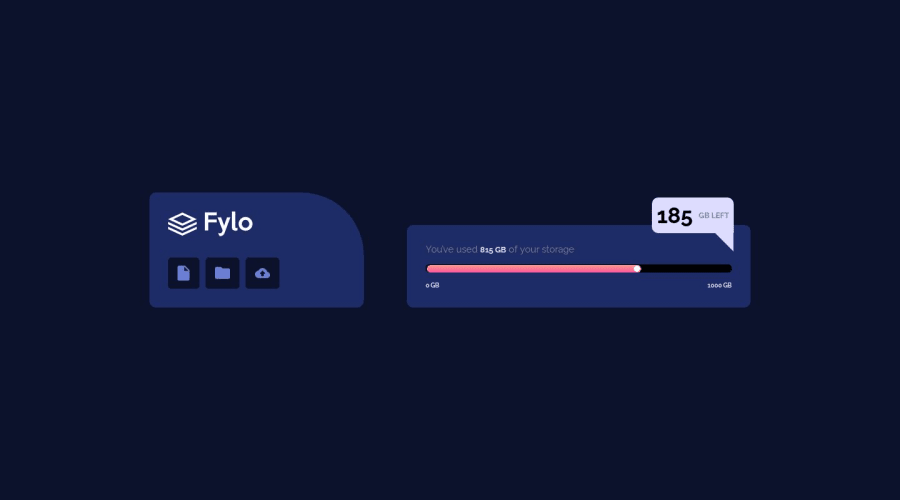
This looks pretty good. A couple things the background color for the bubble should be #FFF. There should be a background image. Looks like you got all the hard parts right.
1@vtejaetaPosted over 4 years ago@norman02 Thanks for the suggestions. I can't understand why it is not showing background image here though I have added it. When I am previewing the site background image is visible.
0
Please log in to post a comment
Log in with GitHubJoin our Discord community
Join thousands of Frontend Mentor community members taking the challenges, sharing resources, helping each other, and chatting about all things front-end!
Join our Discord
