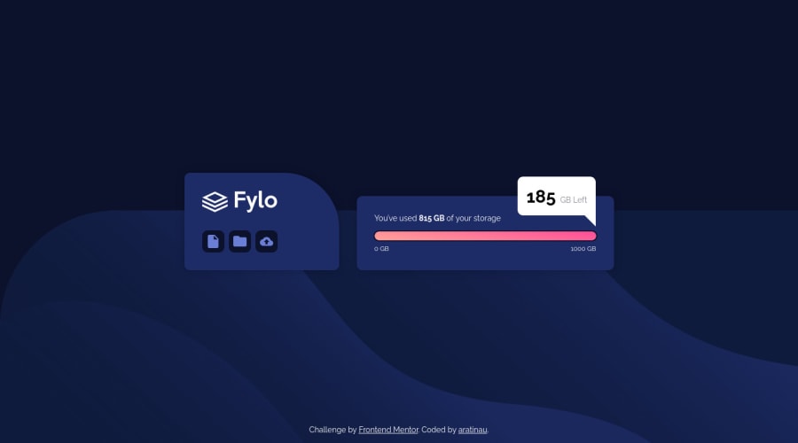
Design comparison
Solution retrospective
I'm happy with the way I made my triangle. I used ::after on the bubble.
.space-left-bubble::after {
    content: " ";
    position: absolute;
    bottom: 0;
    right: 0;
    height: 15px;
    width: 15px;

    /* triangle part */
    --size-triangle: 20px;
    border-top: var(--size-triangle) solid white;
    border-left: var(--size-triangle) solid transparent;
    transform: translateY(var(--size-triangle));
}
Community feedback
- @Finney06Posted over 1 year ago
Hello Aymeric 👋. Good job on completing the challenge !
Here are some suggestions regarding your code that may be of interest to you.
HTML 🏷️:
To clear the Accessibility report:
-
Images should have alternate text.
<img class="img-bubble" src="images/icon-upload.svg" alt="upload icon">this provides alternative text descriptions of images for people who are visually impaired and rely on screen readers to navigate the web. Screen readers can read the alt text aloud, enabling these users to understand what the image represents and how it relates to the content on the page. Overall, including alt text in HTML is an important best practice for creating accessible and user-friendly web content. -
Wrap the page's whole main content in the
<main>tag. -
Always avoid skipping heading levels; Starting with
<h1>and working your way down the heading levels (<h2>,<h3>, etc.) helps ensure that your document has a clear and consistent hierarchy. -
Use HTML5 semantic elements such as
<header>,<nav>,<main>,<aside>, and<footer>to define these sections.
I hope you find it helpful!😏 Above all, the solution you submitted is 👌. 🎉Happy coding!
Marked as helpful0@aratinauPosted over 1 year ago@Finney06 Thank you for your suggestions, I will apply them immediately
0 -
Please log in to post a comment
Log in with GitHubJoin our Discord community
Join thousands of Frontend Mentor community members taking the challenges, sharing resources, helping each other, and chatting about all things front-end!
Join our Discord
