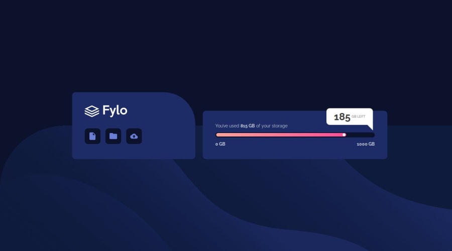
Design comparison
Solution retrospective
It was really hard to apply that box position to work dynamically, not only in tasks breakpoints of 1440px and 375px.
I really want to get review from more experienced coders Do I did it right? Or is it any common simple solution on how to attach absolute object to a point in a flow. Googling didn't help. Mine works just on media queries in a breakpoints
Any other task compared to this absolute object was quite simple and understandable
Community feedback
- @NeoScripterPosted 9 months ago
The same here. I spent 2 hours applying the flexible styles before I realized it all goes to hell because there is very little text and the boxes can't be responsive based on the text size. I had to set a fixed height of the left box and the same minimum height of the right one. I set the width of the main container in vmax, which allowed it to smoothly adjust to the screen size, it was really nice. I spent so much time on this one, so I can totally relate.
0 - @grgrnkooPosted 9 months ago
After reviewing other solutions I understood only one thing. It doesn't have to be full-flexible. I did a ton of extra job applying this. But it still works, so my job was not pointless
0
Please log in to post a comment
Log in with GitHubJoin our Discord community
Join thousands of Frontend Mentor community members taking the challenges, sharing resources, helping each other, and chatting about all things front-end!
Join our Discord
