

Design comparison

Solution retrospective
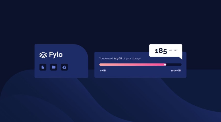
I was happy i got to understand the main logic behind how to create shapes with the help of css. I can now easily estimate an almost accurate time to complete a project. This particular layout was easy but I do think i can improve on a few aspects.
What challenges did you encounter, and how did you overcome them?I faced the difficulty on setting the background image in the mobile version of the website. I used both an image tag and a background image on the body. The issue i faced was with the image tag the content all moved down after the background i tried setting differing z-indices but it didnt work. At the end I used the backgroun-image property on the body which worked well after adjusting the size and height.
What specific areas of your project would you like help with?I would like someone to review the responsiveness of the card on the mobile version and see if i could improve on the 1st card and use some better ways to style images.
Community feedback
Please log in to post a comment
Log in with GitHubJoin our Discord community
Join thousands of Frontend Mentor community members taking the challenges, sharing resources, helping each other, and chatting about all things front-end!
Join our Discord