Design comparison
SolutionDesign
Solution retrospective
Feedbacks are appreciated
Community feedback
- @brasspetalsPosted almost 4 years ago
Hello again, Vishal!
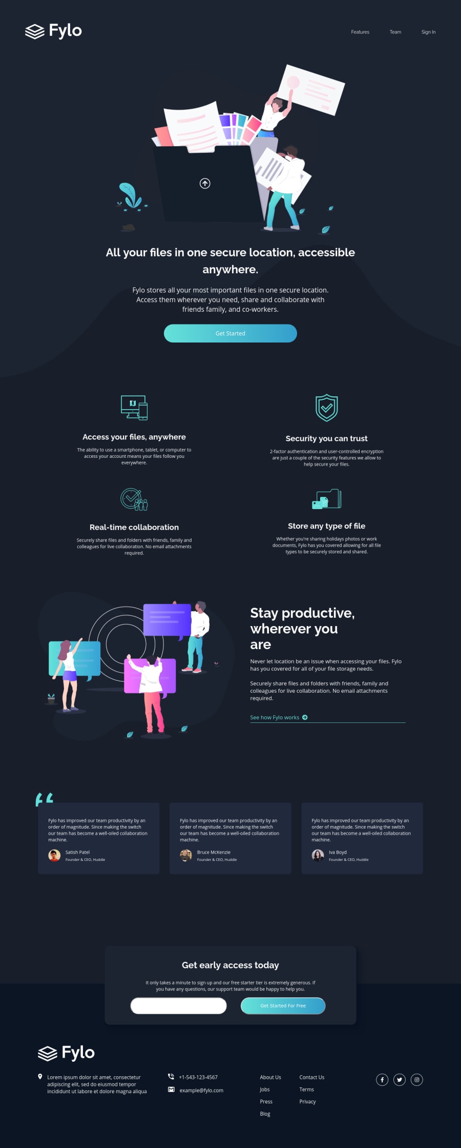
Good job on this challenge! It responds well and looks good when tested on larger screens(1920px). Yet again, just a few suggestions to make it even better:
- To clear up the errors in your report, simply add labels to your inputs and change the
hrefof your anchor tags to just “#”. - If you remove
display: flexfrom your.ext-link, it will stop the border from stretching past the content. I don’t think it’s really necessary to use flex here, as the text and icon line up well without it. However, if you wanted to keep it, addingwidth: max-contentwould also prevent the border from stretching. - There’s no need to use paragraph tags to wrap the content of your anchor tags.
- Your email input should be
type=“email”rather than “text”. - Your
.button-get-startedshould be abuttonrather than aninput. - I suggest adding a
max-widthor another method to prevent your.addressfrom stretching out into one long line on medium layouts. You could also do this with your.featuredivs so the content doesn’t get too stretched out.
Hope this is helpful, and as always, happy coding!
2 - To clear up the errors in your report, simply add labels to your inputs and change the
- @RocTanweerPosted almost 4 years ago
Hello bhai, I am wondering why using js? I don't see any reason... Will you explain?
0@vishalnirmalPosted over 3 years ago@RocTanweer JS is used for email validation purpose
0
Please log in to post a comment
Log in with GitHubJoin our Discord community
Join thousands of Frontend Mentor community members taking the challenges, sharing resources, helping each other, and chatting about all things front-end!
Join our Discord
