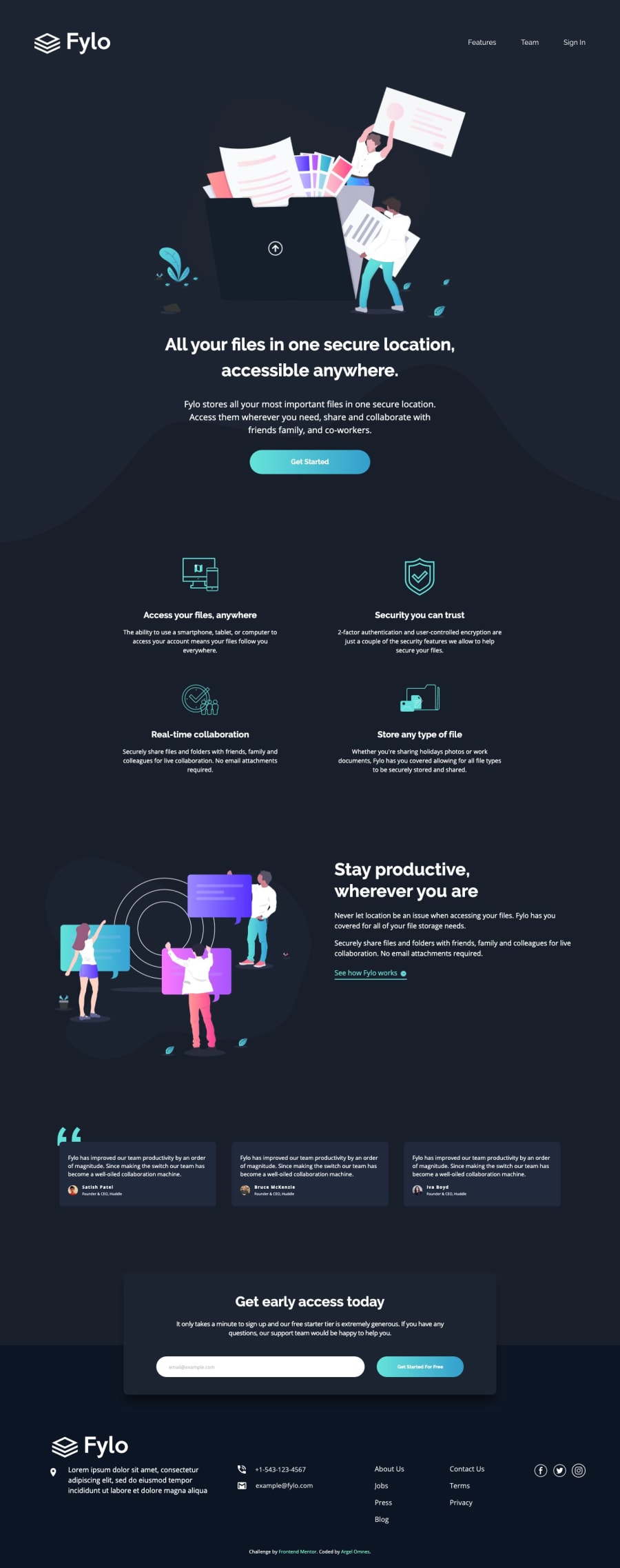
Fylo landing page with dark theme - using CSS Grid
Design comparison
Community feedback
- @devluke88Posted over 5 years ago
Really nice work! It looks like I will need to do Udacity as well! Did you take any Nanodegree courses?
0@afrojac10Posted over 5 years agoReally great, I think I will take the course too.
I probably have it in my saved course 😁
0@argelomnesPosted over 5 years ago@devluke88 Thank you! Nope, I only took the free courses.
0 - @mattstuddertPosted over 5 years ago
Awesome work again Argel, your solution looks great and matches up to the design really well! 👍
Did you take that Udacity responsive course I sent you? If so, how did you get on with it? Looks like you've found a good structure for the responsive side of your CSS now.
0@mattstuddertPosted over 5 years ago@argelomnes haha, I've done that before. Glad you liked it! Udacity is a great resource. Looking forward to seeing your next solution!
0@argelomnesPosted over 5 years agoThanks! I did. I even watched the Responsive Images course after that. Actually, I forgot I had an account in Udacity (haha). When I was about to sign up, my password manager filled the login with my old email. So i just continued with it. But these were the first courses I took with them.
0
Please log in to post a comment
Log in with GitHubJoin our Discord community
Join thousands of Frontend Mentor community members taking the challenges, sharing resources, helping each other, and chatting about all things front-end!
Join our Discord
