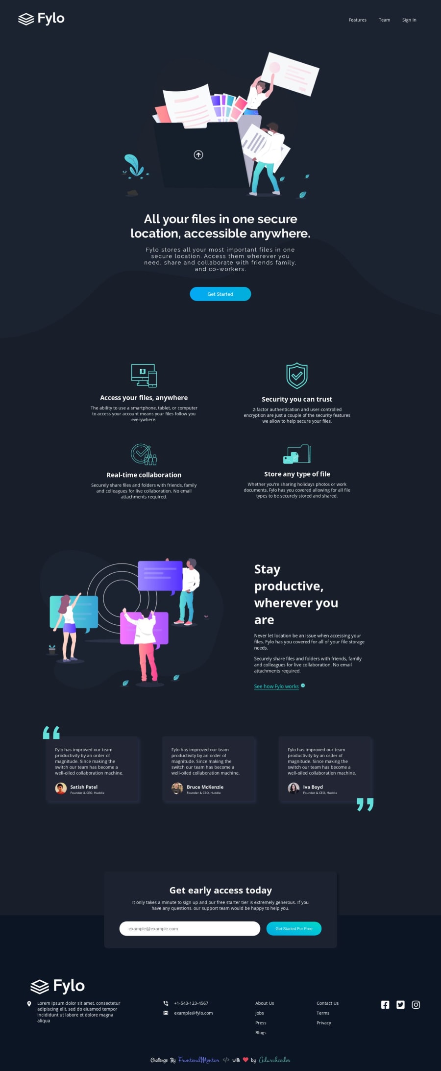
Fylo dark theme landing page-(Responsive and with cool Animation)
Design comparison
Solution retrospective
Hey there! I'd love to hear any suggestions, recommendations or modifications from you amazing peoples😍😍😍, it's not the best but I learned many new things with this challenge🐱🏍.
Community feedback
- @adarshcodesPosted over 4 years ago
Okay, there were a lot of issues aroused and I fix most of them. But some I shouldn't fix like using multiple fonts at a time using google-fonts. using
spaninside anaandiinsideli. So Please Ignore them :)1 - @mattstuddertPosted over 4 years ago
Awesome work on this challenge, Adarsh! As you can see from the design comparison, there are only a small amount of areas where the spacing is slightly off. But you've got the overall layout spot on. You've already brought up the report issues, which you could fix. Having multiple Google Fonts is fine, it's just the
|character that shouldn't be in the URL. You could instead swap this will the%7Cwhich is the URL encoded representation of the|character.I've had an extremely busy week on a work contract this week, so I haven't been able to give as much feedback as I would have liked. It's been truly amazing to see you being so active in the community. Thank you for being such a valuable member! 🙌
1@adarshcodesPosted over 4 years ago@mattstuddert Thank you for the suggestion and also about the encoding for
|(It's something new to me :)), and I'm very lucky to be the part of this amazing community. Everyone here is doing great. May I suggest something???1@mattstuddertPosted over 4 years ago@adarshcodes of course! I always love hearing feedback and suggestions 🙂
0@adarshcodesPosted over 4 years ago@mattstuddert Can we get an option to attach screenshots in the comment section, so that it would be easier to share if we have any issue
1@mattstuddertPosted over 4 years ago@adarshcodes yeah, that’s definitely in the backlog. There are some higher priority tasks to do before, but I’ll definitely be adding that. It would be very useful!
1 - @whimsicurl-creationsPosted over 4 years ago
Nice job, Adarsh! The animations are a nice touch as well. The overall design scales nicely for all screen sizes.
As for the HTML errors - I've avoided the error for the | symbol by just listing the Google Fonts links singly (each font gets its own link). It adds a bit to the code, but it plays nicely with the validators. As for the ul errors, would that be resolved if you put the <i> and <a> inside of <li> elements?
Keep up the great coding and commenting. You're a wonderful asset to this community!
1@adarshcodesPosted over 4 years ago@whimsicurl-creations Thanks for your feedback, I'm going to update the changes :)
1
Please log in to post a comment
Log in with GitHubJoin our Discord community
Join thousands of Frontend Mentor community members taking the challenges, sharing resources, helping each other, and chatting about all things front-end!
Join our Discord
