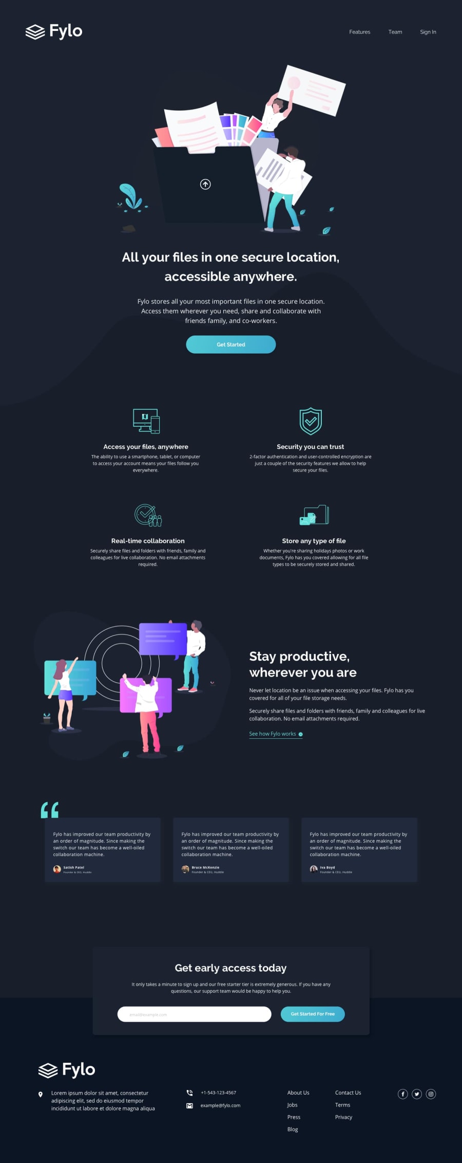
Design comparison
SolutionDesign
Community feedback
- @mattstuddertPosted over 4 years ago
Hey Sufyan, nice work on this challenge! Your solution looks really good. As you can see from the design comparison there are only a few small areas where you could make spacing tweaks to match up to the design. You've got really close!
Here are a couple of other pointers after taking a look at your code:
- You're nesting your selectors a lot in Sass. This is a powerful feature in Sass, but it's easy to misuse. For example, one of your generated CSS selectors is
.testimonial-block .grid-view .card .user-info-block .user-text .bold-textwhen it could just be.bold-text. As a rule of thumb, I try to never nest more than 4 levels deep. - Have you ever tried using
min-widthmedia queries instead ofmax-width? It's quite a common workflow with front-end developers to use them and work mobile-first. It can often lead to less CSS code and has the benefit of loading in fewer styles for mobile users, which can be a nice performance gain.
I hope that helps. Let me know if you have any questions 👍
0 - You're nesting your selectors a lot in Sass. This is a powerful feature in Sass, but it's easy to misuse. For example, one of your generated CSS selectors is
Please log in to post a comment
Log in with GitHubJoin our Discord community
Join thousands of Frontend Mentor community members taking the challenges, sharing resources, helping each other, and chatting about all things front-end!
Join our Discord
