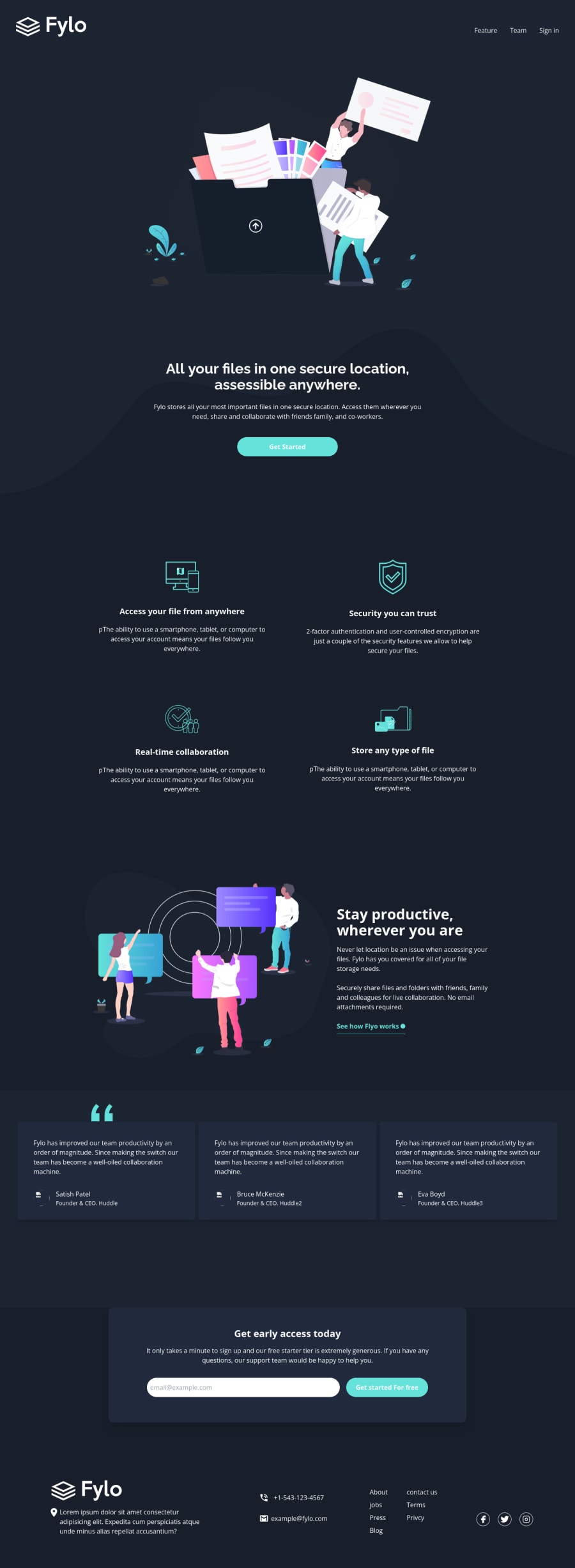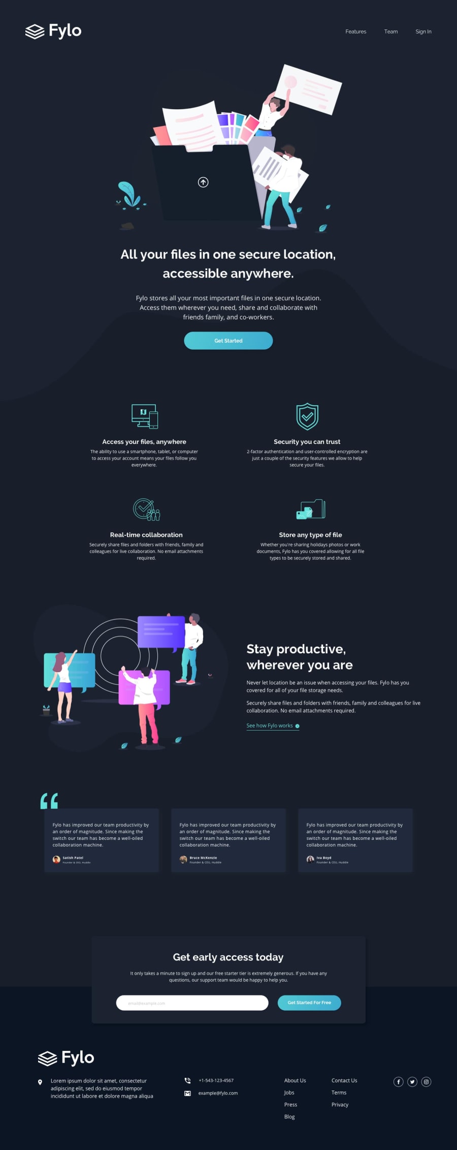
Design comparison
Solution retrospective
had a difficult time with this , but i'm so happy with result hope to see your feedback
Community feedback
- @hebrerilloPosted over 2 years ago
Good job man! I just saw one problem. If you use a view port width of 450px, you will realize that the logo and the links in the header are stick together.
One way to solve this problem is to set this style in the header for mobile screens: flex-direction: column;
And then set back 'flex-direction:row' in the media query for desktops (min-width:768px)
The rest of the implementation is very good!
Marked as helpful1@AhmaadAlharbiPosted over 2 years ago@hebrerillo good notice , thank u so much for your feedback
1
Please log in to post a comment
Log in with GitHubJoin our Discord community
Join thousands of Frontend Mentor community members taking the challenges, sharing resources, helping each other, and chatting about all things front-end!
Join our Discord
