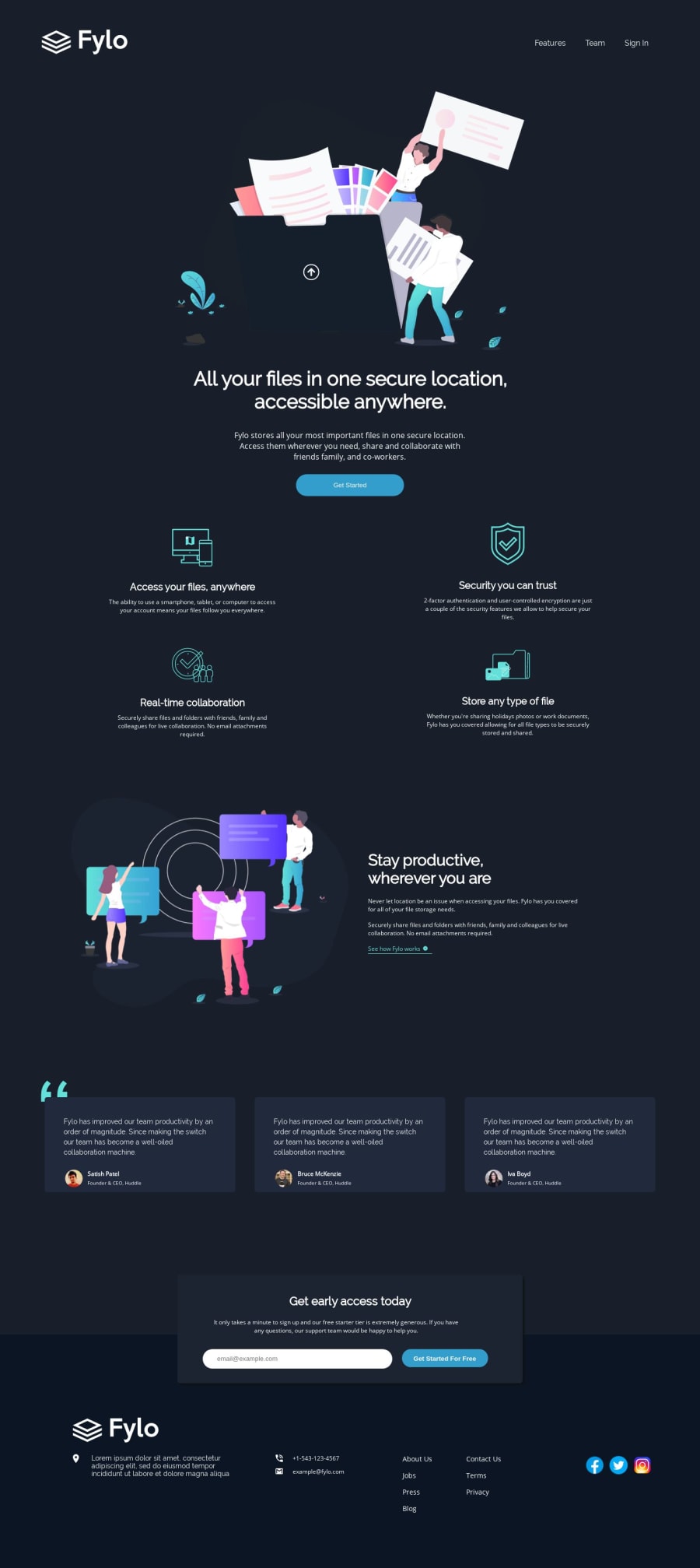
Design comparison
Solution retrospective
Hi fellow devs! Kindly Check out my solution and offer corrections where needed. Thank you
Community feedback
- @PJMantossPosted over 4 years ago
Thank you very much for your observations. I'll work on them ASAP! Thank you
0 - @mattstuddertPosted over 4 years ago
Nice work on this challenge, PJ! You've done a really good job. You can see from the design comparison that it's just small spacing and sizing tweaks that would be needed to get it looking exactly like the design.
Quick heads up that you're only setting
box-sizing: border-box;on thehtmlelement. So all other elements will be using the W3C definition of the box model and addingpaddingandbordervalues onto thewidthof the whole element. You could add*{ box-sizing: inherit;to update this.Also, the
footercontent gets a little squashed at tablet size, so that could do with a little review. Keep up the great work!0
Please log in to post a comment
Log in with GitHubJoin our Discord community
Join thousands of Frontend Mentor community members taking the challenges, sharing resources, helping each other, and chatting about all things front-end!
Join our Discord
