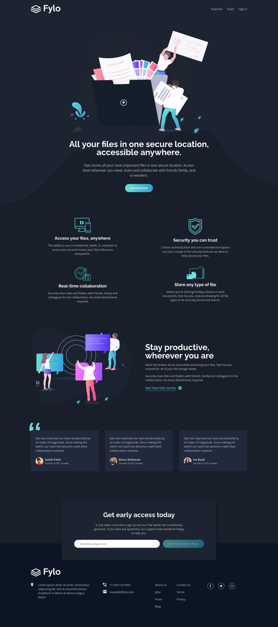
Design comparison
Solution retrospective
Hi, there! I just completed this challenge. It was a fun and crazy project.
I really enjoyed doing this project after practicing CUBE CSS and Utopia (fluid type scale & sizes) for a while. I think I haven't paid that much attention to every small detail (ranging from a11y concerns to :focus and ::selection processes) before. I learned a lot from this project.
I have some questions, too. While inspecting the design at the beginning, I saw that all images (except the brand logo) are decorative. So, I set them empty alt tag and aria-hidden="true". What do you think about it?
Also, in order to create the linear-gradient on buttons, I used ::after pseudo-element and set background-image on it. So, I could then change the opacity on hover. Also, as a fallback, I set background-color for button itself. Is it a good practice to implement? What approach would or did you take?
Leave any feedback or suggestions you have. It means the world to me!
Community feedback
Please log in to post a comment
Log in with GitHubJoin our Discord community
Join thousands of Frontend Mentor community members taking the challenges, sharing resources, helping each other, and chatting about all things front-end!
Join our Discord
