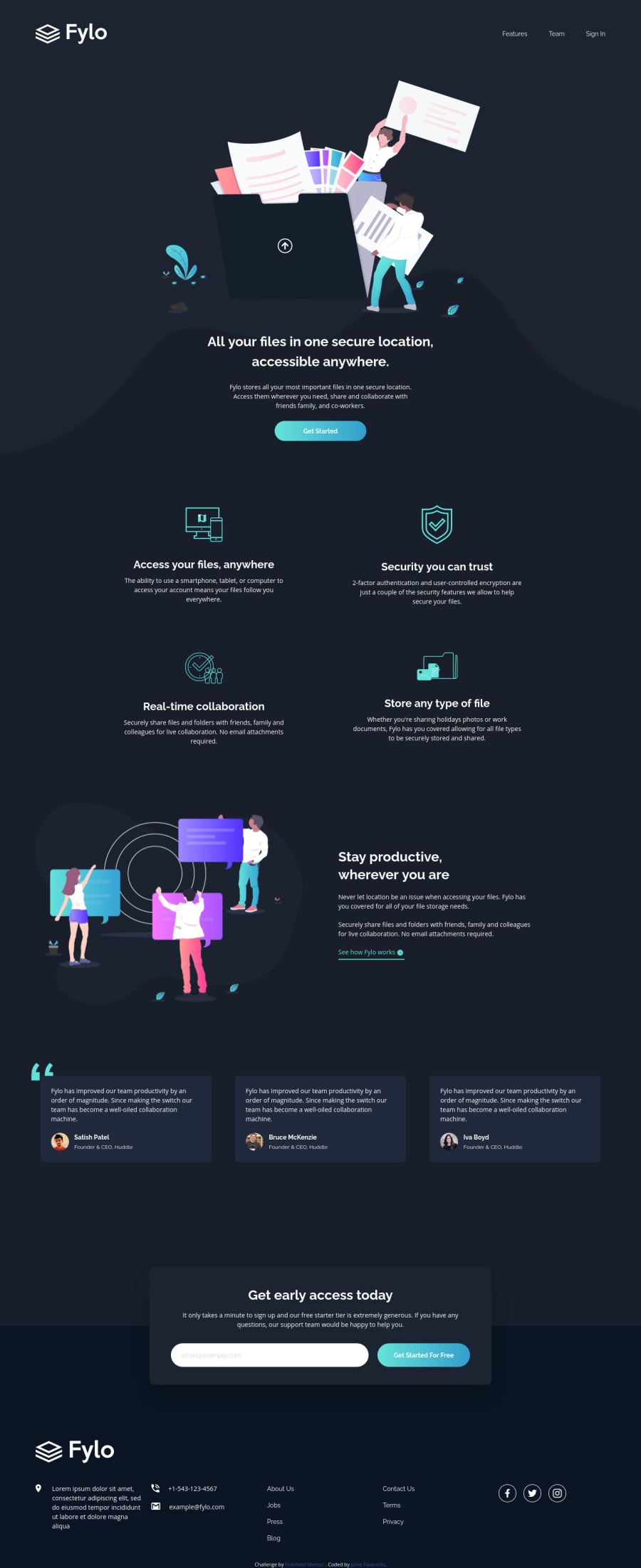
Fylo dark theme landing page using Tailwindcss
Design comparison
Solution retrospective
The background svg images aren't accurate any suggestions?
Community feedback
- @ApplePieGiraffePosted over 4 years ago
Hey, Jome Favourite! 👋
Your solution looks good and responds well! 👍
The background SVGs may not be aligned perfectly with the design, but I think they look fine (and pretty good) in your original solution. 😅
I suggest,
- Giving the navigation links in the header and footer a hover state (such as a change in color or size or something).
- Turning the "See how Fylo works" button and social media links in the footer into actual links using the anchor tag.
Keep coding (and happy coding, too)! 😁
2@jomefavouritePosted over 4 years agoThanks, I'll make changes @ApplePieGiraffe
0@grace-snowPosted over 4 years agoFrom quick glance at your html, I'd add h2s to each section (like features and testimonials) to give a clearer document structure. You can make these visible to screen readers only if not in the original design, but they should still be in the document really.
I would also try to improve your alt text or leave the alt tags empty (to denote decorative images). The alt text at the moment didn't tell me what the images show.
1
Please log in to post a comment
Log in with GitHubJoin our Discord community
Join thousands of Frontend Mentor community members taking the challenges, sharing resources, helping each other, and chatting about all things front-end!
Join our Discord
