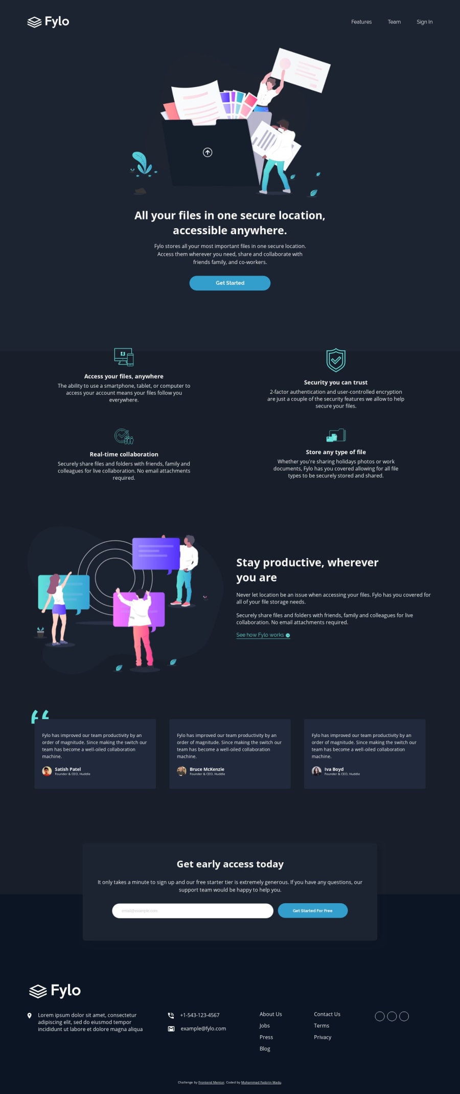
Fylo dark theme landing page using grid and flex css
Design comparison
Solution retrospective
please review my code and let me know what i need to improve. thanks in advance
Community feedback
- @rafaelmaiachPosted almost 5 years ago
Hello, congrats on your solution. Very well done! As I checked, you used different html tags to correspond with what you were building and used them correctly, this is great
For a feedback, I would check the wave effect you made, at least for me, when I check the preview, it isn't being shown correctly. Also, the images seems to lose resolution when rendered too big for me as well.
As I use a widescreen monitor, the text elements have their width bigger. Maybe you could define a max-width value, so you can have smaller blocks and would be better to read the information.
2@fadzrinmaduPosted almost 5 years agohai @rafaelmaiach Sorry about the preview, I tried to generate the re-generate but the result remains the same. thank you for the feedback i will fix it
0
Please log in to post a comment
Log in with GitHubJoin our Discord community
Join thousands of Frontend Mentor community members taking the challenges, sharing resources, helping each other, and chatting about all things front-end!
Join our Discord
