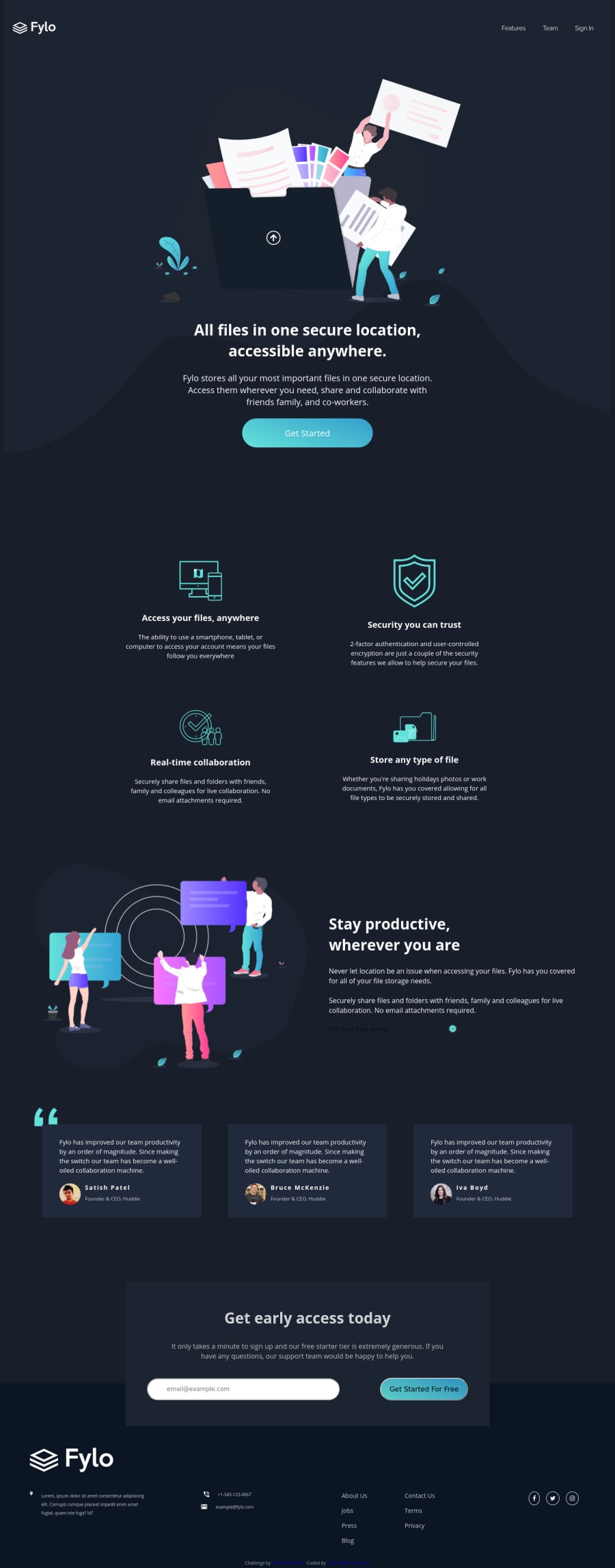
Fylo Dark Theme Landing Page using CSS grid and flexbox
Design comparison
Solution retrospective
Hello everyone,
this is my 3rd challenge. Kindly give your opinions.
Thank you
Community feedback
- @grace-snowPosted almost 4 years ago
Hi Iyanu,
I've had a look through this and have some suggestions for you. I'm in a bit of a rush so will just bullet-list them out, hope that's ok:
- In your repo, don't remove all the readme and designs. Designs and styleguide really help for comparison of what you're trying to achieve. And if you want to change your readme, that's ok but should be still outlining the goals of your project, what you've learnt or hope to improve, and it must attribute Frontend Mentor still
- You've used a paragraph as a button at the moment. That needs to be a link tag in HTML and needs things like focus and hover states. It could even be an anchor link that jumps you down the page to the form.
- On mobile, your font sizes are huge, definitely too big and much larger than the designs.
- Also on mobile, the logo and nav aren't fitting on one line. On small screens like iPhone 5 the nav actually goes off screen
- Look out for alignment of different section content. For example, your review boxes on mobile are narrower than the newsletter below. You want everything to line up on either side down the whole page
- In your form you need a label or aria-label on the input. The input and button still have some default browser styles on like borders or shadows which is making them not match the design, and the button text color doesn't match the design
- I would make the form wrap onto two lines sooner so the button cannot go over two lines and appear taller than the input (although that may be solved once font sizes are smaller)
- Icons in the footer are tiny. Try giving them a height and width of 1em so they match their corresponding text
- Remember to add hover and focus states to links - they don't really look like links in the footer at the moment, which is partially down to the design, but you can improve their interactive look by adding those states
- your social icons need heights and widths, plus aria-labels or written link content so it's clear where they go
- I would make the email and telephone in the footer into links as well
- Looking at HTML, you need to sort heading order. You have no h1 at the moment. Each section under that should be headed by a h2, no matter what the font size in the design - any sub sections within those h2 sections can have h3, etc.
- I'd strongly advise only using single classes for styling wherever possible. You are nesting your css selectors quite deeply at the moment which will cause specificity problems in bigger projects. e.g.
.intro p
has a specificity score of 11 (one class selector, one element selector). If you used a class on that paragraph instead likeintro-paragraph
(or.intro__text
for a BEM naming style) the specificity score would be 1. Lower specificity leads to cleaner more maintainable CSS. - I would also advise in future projects working from smallest screens first and using min-width media queries instead. I think you will find this much easier.
Sorry it's so long, I hope you can decipher and pull out some useful info from all that :)
0@enigmirePosted almost 4 years ago@grace-snow
Thank you so much grace for the comprehensive review. I have made some corrections and I hope it's better now. Although not perfect, I will edit again.
0@grace-snowPosted almost 4 years ago@i-codde make sure you inspect in dev tools a lot and make every change very intentionally, but by bit. Don't rush it, this stuff all takes time.
0 - @abhik-bPosted almost 4 years ago
Hey Iyanu , You have done a amazing work 💯
There are some issues though please try to fix that otherwise your solution seems perfect to me
0@grace-snowPosted almost 4 years agoHi @abhik-b,
When you give feedback, try to be specific if you can.
Eg: What did you notice that you think needs fixing? What screen size are you viewing on, or did you notice something in the code? Have you inspected the code, and if so can you suggest any causes or solutions to things you're seeing? etc... ☺
0
Please log in to post a comment
Log in with GitHubJoin our Discord community
Join thousands of Frontend Mentor community members taking the challenges, sharing resources, helping each other, and chatting about all things front-end!
Join our Discord