Not Found
Not Found
Not Found
Not Found
Not Found
Not Found
Not Found
Not Found
Not Found
Not Found
Not Found
Not Found
Not Found
Not Found
Not Found
Not Found
Not Found
Not Found
Not Found
Not Found

Submitted

fylo dark theme landing page

@tushar416

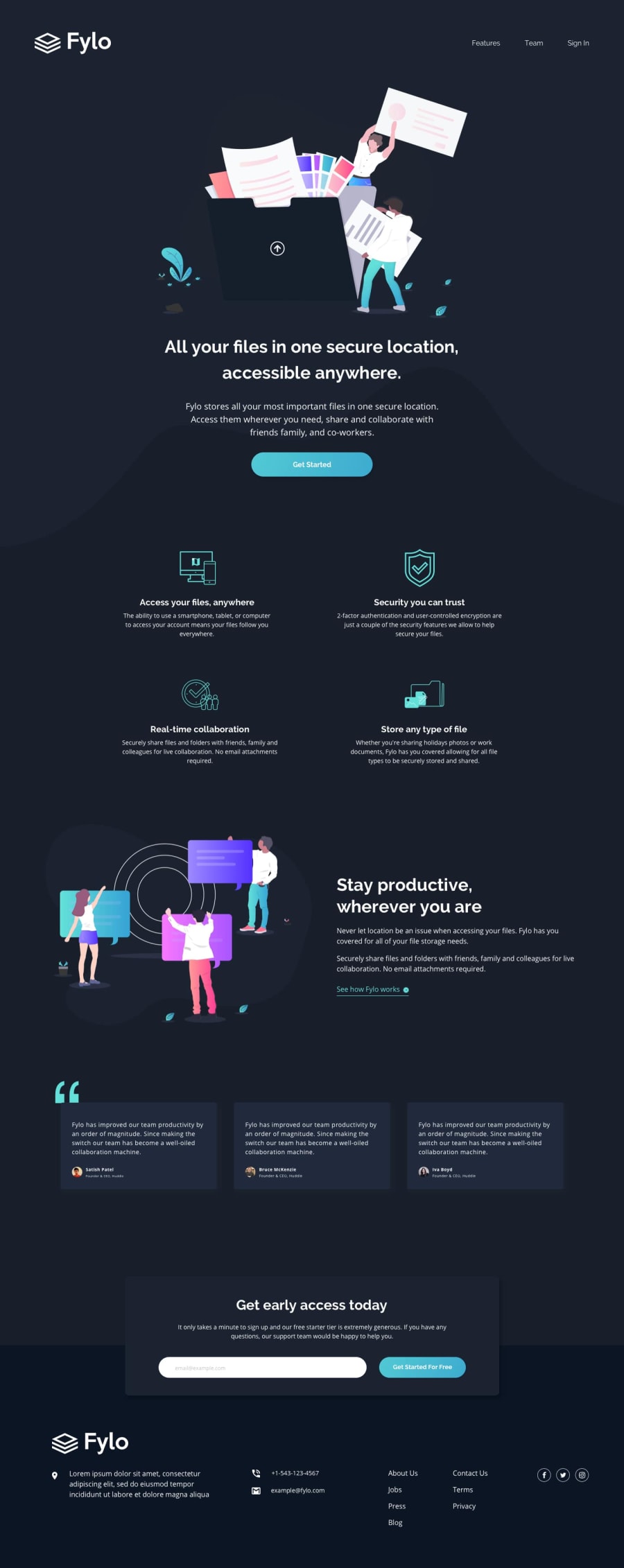
Desktop design screenshot for the Fylo dark theme landing page coding challenge

This is a solution for...

  • HTML
  • CSS
  • JS
2junior
View challenge

Design comparison


SolutionDesign

Solution retrospective


Attention! Now you read it! So can you check my code? I did more than 6 projects and got no comments. It would be nice if you bless me with your knowledge and experiences and give me a nice suggestion for my code, to understand my mistakes or how I can be more efficient.

Thank you

Community feedback

P

@BurritoDoggie

Posted

Hello Tushar416,

Wonderful job! Yours is so close to the original! Making the words become bold when you hover over them is definitely something I would like to learn. And everything seams to fit very well for people with phones or tablets. I could not find anything that you could improve on since you are much better than me. If you look at my profile you will see that I have done a much more simpler challenge.

Keep Coding!

                         (@@)
                          \__/
2

@tushar416

Posted

@BurritoDoggie thank you so much, friend!

1
T
ApplePieGiraffe 30,545

@ApplePieGiraffe

Posted

Hey there, tushar! 👋

Nice work on this challenge! 🙌

A few things I'd like to suggest are,

  • Horizontally centering the items in the features and the "Wherever you are, stay productive" sections of the page when the layout first changes from desktop to tablet/mobile.
  • Turning the navigation links in the footer of the page into actual links by wrapping each of them in an anchor tag.
  • Adding another media query or two to make sure the content of the CTA section isn't so squished right before the layout changes from tablet to mobile.
  • Removing the border from and add cursor: pointer to the button of the CTA section.
  • Removing the border around the input element in the CTA section, too.
  • Making sure there is always some space between the logo in the footer of the page and the CTA section above it (even when the width of the screen decreases).
  • Adding a max-width to the wrapper containing the testimonial cards so that they do become too space out and far from each other on extra-wide screens.
  • I don't think you can add a smooth transition to font-weights (for various reasons), so a better hover effect for items like the links on the page might be to change their color (something you can add a smooth transition) on instead.
  • Labeling the input element in some way to clear up an error on your solution report and make your solution more accessible.

Hope those tips help (and make up just a little for the lack of feedback on your other projects)! 😉

There are so many people submitting solutions on the platform and sometimes it's hard to reach everyone! 😅

Keep coding (and happy coding, too)! 😁

2

@tushar416

Posted

@ApplePieGiraffe I love your brief suggestions. It's a huge help from your side; I appreciate it! Thank you so much.

1

Please log in to post a comment

Log in with GitHub
Discord logo

Join our Discord community

Join thousands of Frontend Mentor community members taking the challenges, sharing resources, helping each other, and chatting about all things front-end!

Join our Discord