Submitted about 2 years ago
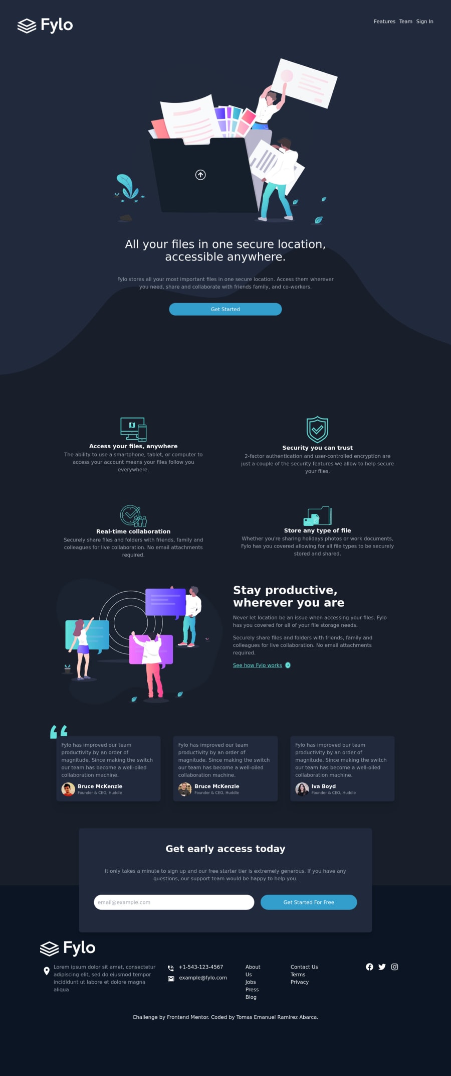
Fylo dark theme landing page Tailwindcc + React
@emanuel-ra
Design comparison
SolutionDesign
Solution retrospective
Hi community, i started to learn about React, then i used it in this challenge. any feedback is welcome 😀
Community feedback
- @denieldenPosted about 2 years ago
Hello Emanuel, You have done a good work! 😁
Some little tips to improve your code:
- use
maintag to wrap the main content of page and improve the Accessibility...header and footertag go out from it andsectiongo inside it. - use
sectiontag to wrap the various section of the page instead of a simplediv - use
articletag to wrap the separate blocks inside the section... blocks like news and cards - remove all unnecessary code, the less you write the better as well as being clearer: for example the
picturecontainer of image when the image is only one inside it: you can usepicturetag to change image by resolution -> read here - remove
max-widthfromsectiontag and create class namedcontainerand use it inside the sections - add
transitionon the element with hover effect
Keep learning how to code with your amazing solutions to challenges.
Hope this help 😉 and Happy coding!
Marked as helpful0@emanuel-raPosted about 2 years ago@denielden Thaks!! your feedback is really helpful 😁
1 - use
Please log in to post a comment
Log in with GitHubJoin our Discord community
Join thousands of Frontend Mentor community members taking the challenges, sharing resources, helping each other, and chatting about all things front-end!
Join our Discord
