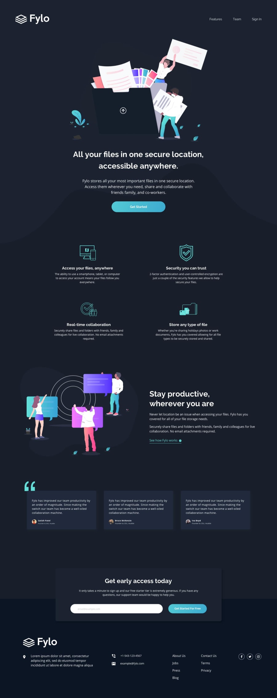
Design comparison
Community feedback
- @DaFlusherPosted 11 months ago
Nice work Jacob! I almost couldn't tell the transition between the hero section and the next section. The background was quite something. I noticed the mobile screen for the links(about us down to privacy) had a smaller margin/padding when compared to the rest of the footer so it was a bit to the left of the screen. Well done!
Marked as helpful0@jacobaroberts1993Posted 11 months agoThank you @DaFlusher !
I had some issues with the background SVG's and decided to use gradients instead. Not ideal, I will try to implement those smoothly on my next project.
I also corrected the footer icon padding / margins so everything aligns properly. I appreciate the helpful and constructive feedback!
1
Please log in to post a comment
Log in with GitHubJoin our Discord community
Join thousands of Frontend Mentor community members taking the challenges, sharing resources, helping each other, and chatting about all things front-end!
Join our Discord
