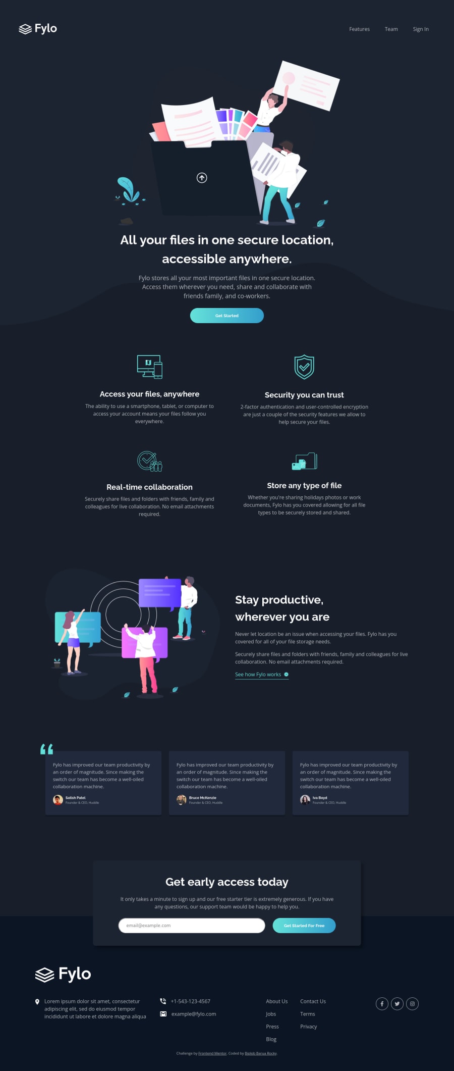
Fylo dark theme landing page || Responsive || Mobile first
Design comparison
Solution retrospective
I need some help on these issues:
- What is the best approach/way to make the background pattern pixel perfect as shown on the design?
- The z-index is not working on the 'quote' in the review section. How to fix it?
- Is there a way to animate the bottom part (when visible) with only JavaScript? Or do I need some libraries/frameworks?
I tried to make it close to the design. Yet I might miss out on many things or do wrong in some parts. Please let me know if you notice. Thanks in advance :)
Community feedback
- @dwhensonPosted over 2 years ago
Hey @Drougnov lovely job here! The page looks great!! π₯³. Here's some things to think about:
-
Personally, I never worry too much about pixel perfection. I go for "pixel pretty close" here's a great article about this: https://www.joshwcomeau.com/css/pixel-perfection/
-
The quote should be on top of the review section? It is on my screen - can you clarify the issue there? Sorry if I'm missing something obvious!
-
And again for the animation - which 'bottom part' would you like to animate? You can do most things without a library, but in some cases it might be a lot of work!
Lastly, you might want to think about stopping the page from spreading too wide a very large screens. There are many ways to do this but I set a grid on the body element, with three columns, using a class selector as follows:
.center-content { display: grid; grid-template-columns: minmax(1rem, 1fr) minmax(375px, 1440px)minmax(1rem, 1fr); } .center-content > * { grid-column: 2; }
The 1440px is the max-width you want the main content to be, and the 1rem value is the smallest spacing you want on either side of the main content on small screens (I sometimes put this to 0 and use a container to add padding to each section).
The second part positions all direct children of the body in this nicely sized middle column. In my case, mostly, my header, main, and footer are the middle column and stops them from going wider than 1440px. Itβs also pretty easy to βbreakβ elements out of this constraint if you need to.
Other people use container classes to do the same thing. This article has a good run down of alternative approaches https://css-tricks.com/the-inside-problem/ You will note I am actually using the approach the author doesn't like!
Either way, it's a good idea to find an approach that works for you as you'll need this for a lot of FEM challenges.
Cheers
Dave
Marked as helpful1@DrougnovPosted over 2 years agoHi @dwhenson, thank you for all this valuable information and your valuable time :)
These blogs are very helpful and informative.
About the quote: I wanted the quote SVG under the review section with z-index. However, I found a solution to that as @vanzasetia mentioned.
Again, thanks a lot, and have a good day my friend <3
0 -
- @vanzasetiaPosted over 2 years ago
Hi, @Drougnov! π
Regarding your questions.
- For the background image (
bg-curvy
), I almost did the same thing as you did. But, I set thebackground-size: 100%
and in my opinion it made looking similar to the design. As a side note, I would not recommend focusing to make your solution as "pixel-perfect". But rather, focus on the code quality more especially you just get started. There's a blog post by Josh Comeau about chasing "pixel-perfect" dream. - For the
z-index
, I can't figure out how to make the pseudo-element to go behind the relative element. I tried removing thez-index
from the.review_section .first-review
and the result is the quote icon disappear. I tried playing around with it but still no result. So, my recommendation is to make the quote icon as a background image of the.review_section
. - I am not sure with your question. Do you mean a scrolling effect (like this)? Or are you talking about the form validation?
About the
z-index
, on my solution, I usedimg
element to show the quote icon and I managed to put the quote icon behind the card by doing the following..testimonials__card { position: relative; } .testimonials__quotes { position: absolute; top: -2.5rem; left: 0; z-index: -1; }
It's straightforward and the important thing, it is working! π
So, maybe you can inspect my solution or try to use
img
element or may be make it as abackground-image
of the.review_section
. (I can't explain about the issue π)Now, for the feedback.
- The alternative text of the logo should be the name of the company. It is an information that screenreader users may use to know the site/project name.
- For the
aria-label
, I recommend making sure that it is a link but at the same time telling about the image, like "Home | Fylo". If you choose to usearia-label
as the text content of the link then leave thealt
empty. The same goes for the opposite, if you choose to use alternative text of the image for the text content of the link then remove thearia-label
. - If the link is already having the text content then there's no need to use
aria-label
. - Wrap the
nav
element withheader
. The first section that contains theh1
should be the first section of themain
element.header
is used to wrap navigation element whilemain
landmark is used to wrap the main content of the page. - The illustrations are decorative images. So, leave the
alt=""
empty. - I would expect the "Get Started" button as a link that navigates the users to sign-up page or something like that. So, unless you expect different thing to happen after the user clicks the button then it would more likely to be a link.
- Every time you use the
button
element, you need to always specify thetype
of thebutton
. It will make sure that thebutton
behaves properly across multiple browsers. aria-label
is used to add text content for link element that doesn't have text content. A good example would be the social media icon link. Also, it works the same as the visible text content, is should tell what is the link for. So, if it is a facebook icon then thearia-label="Facebook"
would be good enough to tell the screenreader users about the link.
That's it! Hope this helps.
Marked as helpful1@DrougnovPosted over 2 years agoHi, @vanzasetia. Thank you for your feedback and your valuable time.
- I was giving too much thought to the BG image. Thanks for the blog recommendation.
- I wonder why the z-index doesn't work. But the background approach is working fine. So I'm happy with it.
- Yes, like that. But only if it doesn't need a billion lines of code XD
I had very little knowledge about
aria-label
andalt
. You cleared out a lot of things. Thanks for that. Please provide some blogs about them if you can...so I can learn more.Again, thanks a lot. Have a good day, my friend <3
0@vanzasetiaPosted over 2 years ago@Drougnov No problem! π
- Regarding the background image, are you not going to make it look similar to the design? You can do that by making the
background-size: 100%;
(there's no need for the second value). - I still don't fully understand about
z-index
. But, you can read the MDN documentation about "Understanding CSS z-index" - You can use AOS (Animate On Scroll) library to do that. It is easy to use (you don't need to type a lot of code for sure). The link that I shared earlier was also a link to the AOS site.
For
aria-label
, you can learn more about it by reading the MDN documentation for thearia-label
.Some resources to learn about the alternative text.
- Avoid these common alt-text mistakes - The Big Hack
- Axess Lab | Alt-texts: The Ultimate Guide
- Images Concepts β’ WAI Web Accessibility Tutorials
I hope this information is useful!
Marked as helpful1 - For the background image (
Please log in to post a comment
Log in with GitHubJoin our Discord community
Join thousands of Frontend Mentor community members taking the challenges, sharing resources, helping each other, and chatting about all things front-end!
Join our Discord