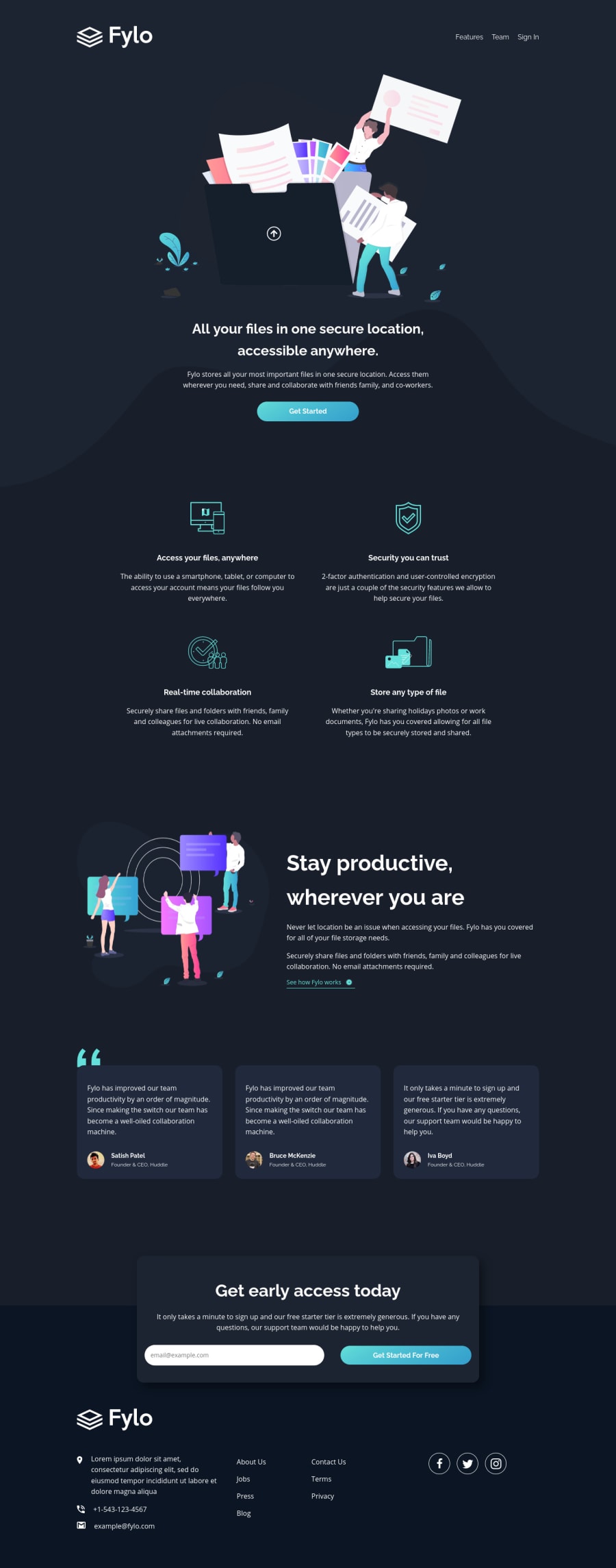
Fylo Dark Theme Landing Page HTML5 CSS3 Sass
Design comparison
Solution retrospective
Hello Everyone! π
I was doing this challenge on my Android phone. Hopefully, it looks good on your deskop. π
Questions:
- I struggled with the footer layout, but this is what I've come up with so far; do let me know if you have any recommendations!
- I am not sure about the accessibility of this solution. So, feedback on the accessibility part is appreciated!
Of course, any feedback is appreciated!
That's it! Happy coding everyone!
Community feedback
- @grace-snowPosted over 3 years ago
Hello
More accessibility feedback :)
- Always include a hidden skip to content link as the first item on a page, linking down to main
aria-label="go to home page"
isn't right. It needs to say the name of the site just as it would for sighted users.Fylo - Home
would be more appropriate. You never need to say "go to..." in link labels as they are already anchor tags (navigation elements), just as you wouldn't need to say "image of" or "picture of" on img tags- Well done for labelling nav elements!
- Personally, I think the page title h1 and associate content belongs in
main
, not header. The header is a separate landmark, a banner. But h1 is important page content. If someone skipped to main content, you wouldn't want them to miss this, as it is the main CTA on the page - Add visible focus styles to all interactive elements - very very important
- On meaningless/decorative svgs with blank alt text, consider adding
aria-hidden="true"
. This is only because Apple voiceover still announces images with empty alt text when it shouldn't - Blockquotes should be inside the figure and the person making the quote be figcaption. The current markup doesn't quite work I think... that's an opinion though, there is no established standard
- the testimonials images are more meaningful imo, I would use the persons name as alt description
- I'm not sure the aside should be an aside as its quite important content... but if you do use asides, make sure they have an label
cta__error-message
needs to have aria-live attribute on it and an ID. It should be hidden using the hidden attribute or display none (hidden from screenreaders fully) until it is relevant and visible. Thats what makes aria-live announce the error to screenreaders when it's shown- email input needs aria-describedby on it linking to the ID of that error message
- the submit button should be a button element not an input type submit (deprecated)
- footer needs
role="contnentinfo"
to ensure it is listed as a footer by all browsers Fylo. Company Logo.
should probably just say "Fylo". Don't be overly verbose :)- markup inside info ul in footer is strange... It should be one list with 3 items, but you have it as a nested list.... I'd be tempted to have all of this including the logo inside an address tag too
- As above, remove the words "go to ... page" on links like
aria-label="Go to about page"
. In fact, they don't need aria labels at all. Remember, using HTML content is always preferable to aria labels where possible as it is translatable. Dont add air where its not needed. This would already be announced as "Link, About" which is fine - screenreader users know that will take them to a page called 'About' - The social icons are missing for me, I can't see them at all.
- The social icon links need more to make them accessible: sr-only text saying the name of each platform, followed by
(opens in new window)
. It's important to communicate when that is going to happen. I also recommend you addrel="noopener"
to any links that open in a new window for security reasons
Hopefully that is helpful info. It's great to see developers considering accessibility like this and requesting this feedback, well done!!
Marked as helpful3@vanzasetiaPosted over 3 years ago@grace-snow Thanks for your feedback on accessibility, but I have two questions about your feedback:
- Always include a hidden skip to content link as the first item on a page, linking down to main, Is that mean that I create an anchor tag that link to the
main
tag? - the submit button should be a button element not an input type submit (deprecated), is that mean that
input
with the type of submit has been deprecated, so I need to usebutton
with the type of submit?
That's it! I am going to do this challenge again with your feedback as a guide.
0 - @pikapikamartPosted over 3 years ago
Hi, regarding about accessibility, these are couple of suggestions that you can tackle in your challenge:
-
always have a
focus-visible
or any visual indicator where a user at, especially when navigating through keyboard. Yourbutton
elements and theinput
element does not have any visual indicator, thus creating confusion where a user is at. It will be really great if you implemented a custom visual, like usingoutline: 2px dashed color
andoutline-offset
orbox-shadow
in theirfocus-visible
-
it would better if you separate the homepage banner link, the one with the logo in the header, separate it from the
nav
element. So that when assistive tech goes to the header, it will read outbanner landmark
then thearia-label
of the website logo. Only putting theul
in thenav
bar -
it would be better if you limit the
header
with just only thenav
items. In your site, you included the hero as well in theheader
which should have been inside themain
element. So that when assistive tech goes to themain
section, it will read out theh1
element -
aria-label
for the submit button in theform
could have been "submit email form" so that it will have a guide to what thatbutton
does. -
instead of "facebook logo", "twitter logo" on the footer social media links, use a more descriptive label since it is a link. Use like "visit us on facebook" or "go to facebook"
-
maybe in the
form
field, prevent the default submit event, then maybe make use ofaria-live
so that it announces if the email is successfully submitted.
I am still not that good about accessibility so maybe those I mentioned could help^
Marked as helpful2@grace-snowPosted over 3 years ago@pikamart I agree with all those, except not quite the one about social link (see below - no need for "go to...", but yes lose the word "logo")
1@vanzasetiaPosted over 3 years ago@pikamart Thanks for your feedback on accessibilities, I will do this challenge again and use your feedback as a guide.
0 -
- @aUnicornDevPosted over 3 years ago
A very small change.. you might have missed it on Android phone π.
The social icons are not centered even after using flex to center it. This is because even though the size of the icons is
24*24
but when wrapped inside a<a>
tag, the line height applies to them and makes the dimensions24*26
making it look a little misaligned. Settingline-height:0
on these anchor tags will work.Marked as helpful1@vanzasetiaPosted over 3 years ago@aUnicornDev Thanks! Now the icons is perfectly on the center!
0 - @NebiyouErsaboPosted over 3 years ago
Hey Vanza π,
I looked at your solution on my PC and it looks great and nicely responsive! I've a few suggestions design wise though.
- First i suggest you to reduce the max-width of the header description to somewhere around 35rem.
- I also suggest reduce the font of the features description to either 0.875rem or 1rem. And set a max-width of 25rem. Then to align everything, maybe add
align-items:baseline;
on the features__list container. - For the the testimonial__card you need to add some more padding to the sides. Something like
padding:1.5rem 1.7rem;
Also, perhaps make the testimonial__text margin for bottom only (instead of top & bottom like it is right now).
Other parts look awesome as far as I can see, well done! I also worked on the same challenge recently, you can def take a look at it and let me know what you think. https://www.frontendmentor.io/solutions/fylo-dark-theme-solution-PYxlNFkZR
Marked as helpful1@vanzasetiaPosted over 3 years ago@Nebiyou12 Thanks for your suggestions! It is really helpful! But I want to ask you a question, what
align-items: baseline
does? It seems nothing change though.0@NebiyouErsaboPosted over 3 years ago@vanzasetia I see you have done it now. If you turn that off, the feature titles will be misaligned. Experiment with it a bit, you'll see what it does (it aligns items at the base of the content).
0 - @palgrammingPosted over 3 years ago
Looks good the only thing I saw was that in your form you have HTML validation and your own validation error message. If you change your input from a email to just a text input you will solve you issue
0@vanzasetiaPosted over 3 years ago@palgramming Sorry, I don't understand what kind of issue that you're talking about. Can you explain it to me?
0@palgrammingPosted over 3 years ago@vanzasetia your input type needs to be
text
notemail
cause with email you are getting browser validation on top of your own.0
Please log in to post a comment
Log in with GitHubJoin our Discord community
Join thousands of Frontend Mentor community members taking the challenges, sharing resources, helping each other, and chatting about all things front-end!
Join our Discord