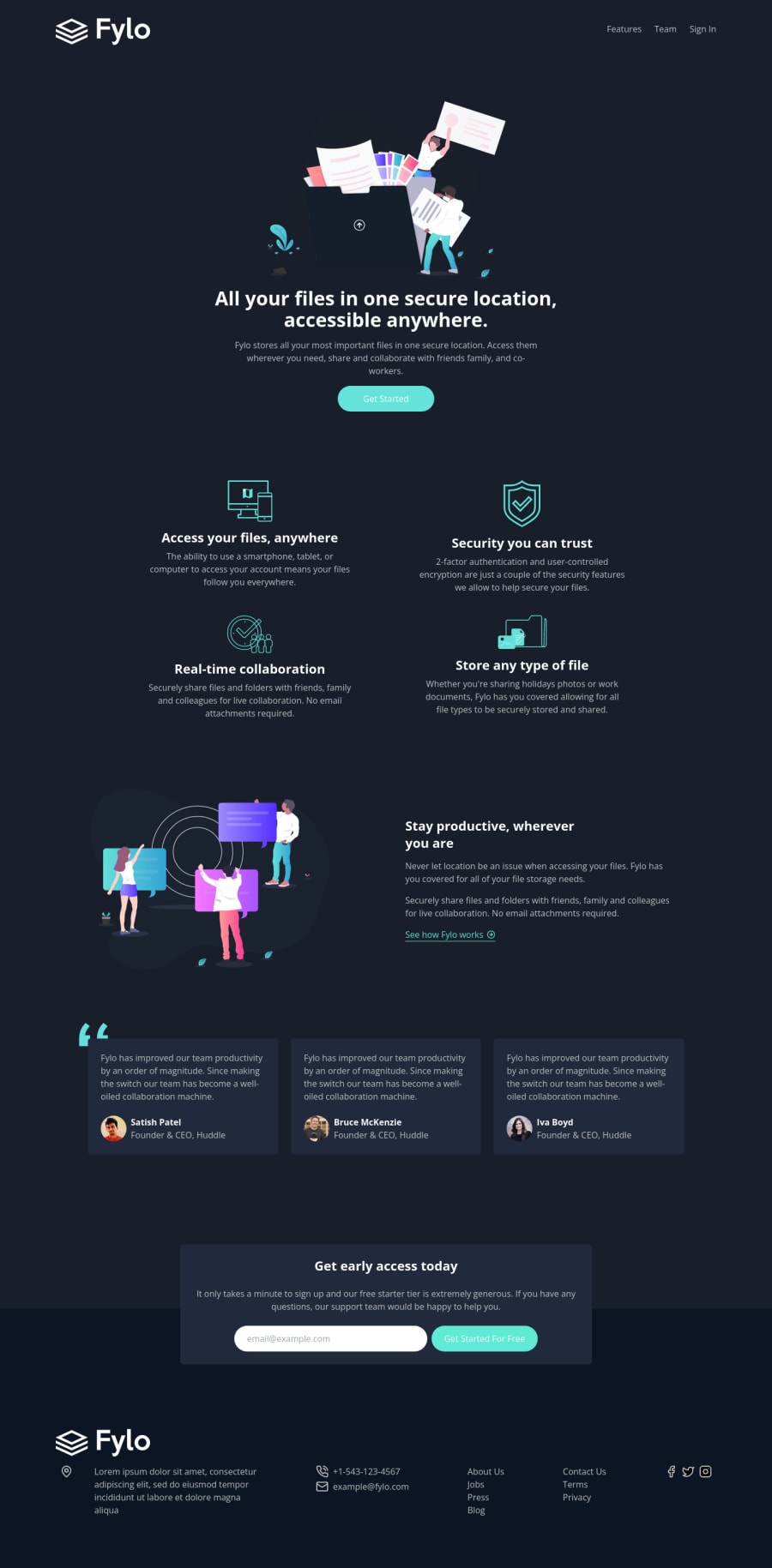
Fylo dark theme landing page - HTML, Tailwind CSS & JavaScript
Design comparison
Solution retrospective
Hi everyone 👋
A fun project to get back in the saddle after taking the summer out to avoid burnout. I wanted to try Tailwind CSS to see what all the utility-first CSS hype is about. Very intrigued to see how it might scale in a larger React app.
I added a mobile navigation and some JS client-side form validation.
Any feedback that could help me to improve would be very welcome!
Happy coding 🤙
Community feedback
- @Kamasah-DicksonPosted over 2 years ago
hi there🖐 your solution looks very great and responsive but one thing is that the background-color of the feature section is not set. it should be different from the actual body background-color which I know you noticed too. But also one thing again is that the svg is just above the feature section...kinda before. it just blends with the background-color of the feature section. besides, Great job there👍
Happy coding🔥🔥
1
Please log in to post a comment
Log in with GitHubJoin our Discord community
Join thousands of Frontend Mentor community members taking the challenges, sharing resources, helping each other, and chatting about all things front-end!
Join our Discord
