Not Found
Not Found
Not Found
Not Found
Not Found
Not Found
Not Found
Not Found
Not Found
Not Found
Not Found
Not Found
Not Found
Not Found
Not Found
Not Found
Not Found
Not Found
Not Found
Not Found

Submitted

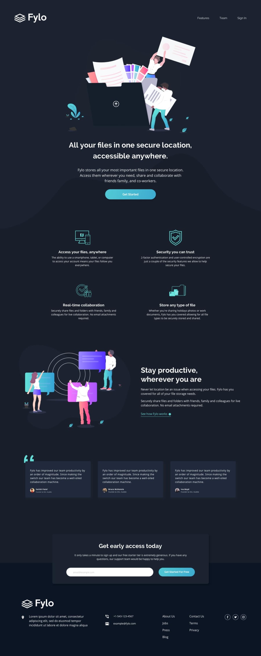
Fylo Dark Theme Landing Page (HTML | CSS | JS Vanilla)

Cheosphere 1,040

@Cheosphere

Desktop design screenshot for the Fylo dark theme landing page coding challenge

This is a solution for...

  • HTML
  • CSS
  • JS
2junior
View challenge

Design comparison


SolutionDesign

Solution retrospective


...made with a lot of love 🤘🏻🙂

Community feedback

Alok Suman 2,380

@Alokray007

Posted

Hello there 👋 @ngdangtu-vn

Good job on completing the challenge !

Your project looks really good!

I have a suggestion about your code that might interest you.

There is an very useful browser extension called Perfect Pixel that allow you compare with the design image and thus see the exact dimensions. I recommend it to you.

I hope this suggestion is useful for future projects.

Other than that, great job!

Happy coding.

Marked as helpful

3
Michel 60

@michelNice

Posted

Hello there! how are you, @Cheosphere?

I have been trying to build a project, However I can not get the navegation the right way. So What i am trying to do is add an unorder list and h2 with flexbox. my goal is

while scrolldown the the IMG shrink to the small and then get back it to normal without push another elements aside as I am doing 2.When it goes to mobile the IMG stay the same size it doesn't shrink at all

I'm 3 day in a row try do doing it own my own, seaching on google, chat gpt , stckover flow you name it...

exemple what I am trying to do:https://www.nestpanos.com

my repository:https://github.com/michelNice/Nest-Panos

Thank you for you time.

by the way.. good job on the project.

1

Cheosphere 1,040

@Cheosphere

Posted

@michelNice Hello, I have reviewed your project, to avoid the displacement of elements, in your tag with the "navbar" class you can set the "justify-content" property with a value of "space-between":

.navbar{
     display: flex;
     **justify-content: space-between;**
     padding-right: 2rem;
     background: network;
     width: 100%;
     top: 0;
     left: 0;
     right:0;
     position: fixed;
}

With this you get the list and h2 elements to be placed on the sides, and remain static.

0
Michel 60

@michelNice

Posted

thank you a lot, @Cheosphere

1
ngdangtu 120

@ngdangtu-vn

Posted

This must be the legendary perfect pixel I've been seeking for since the dawn of our goddamn universe! Tell me, the warrior, what did you sacrifice to achieve such a flawless work like this? I must know!

1

Cheosphere 1,040

@Cheosphere

Posted

Hello @ngdangtu-vn, I have some knowledge of graphic design, what I do is carefully examine the "desktop-design.jpg" file, using photoshop or illustrator, so I can measure the sizes, margins and padding of each element, and apply it to my development to achieve a result almost identical to the UI design that they give us in the project files folder. It's a bit stressful and time-consuming work, but I like seeing the end result.

0
Michel 60

@michelNice

Posted

How are you today , @Cheosphere ?

I've been building a project however I do have some difficulties. well, one those problems is when I hover on the content with the IMG and the transform: scale effect doesn't work, What should I do?

Live project:https://lucent-chimera-a55018.netlify.app/

repository:https://github.com/michelNice/Nest-Panos

0
Val Ery 40

@Valeryio

Posted

How to make the perfect pixel integration like that?

0
Bekzod 300

@bekzodturgunoff

Posted

Loved your work. The match with design is flawless

0

Please log in to post a comment

Log in with GitHub
Discord logo

Join our Discord community

Join thousands of Frontend Mentor community members taking the challenges, sharing resources, helping each other, and chatting about all things front-end!

Join our Discord