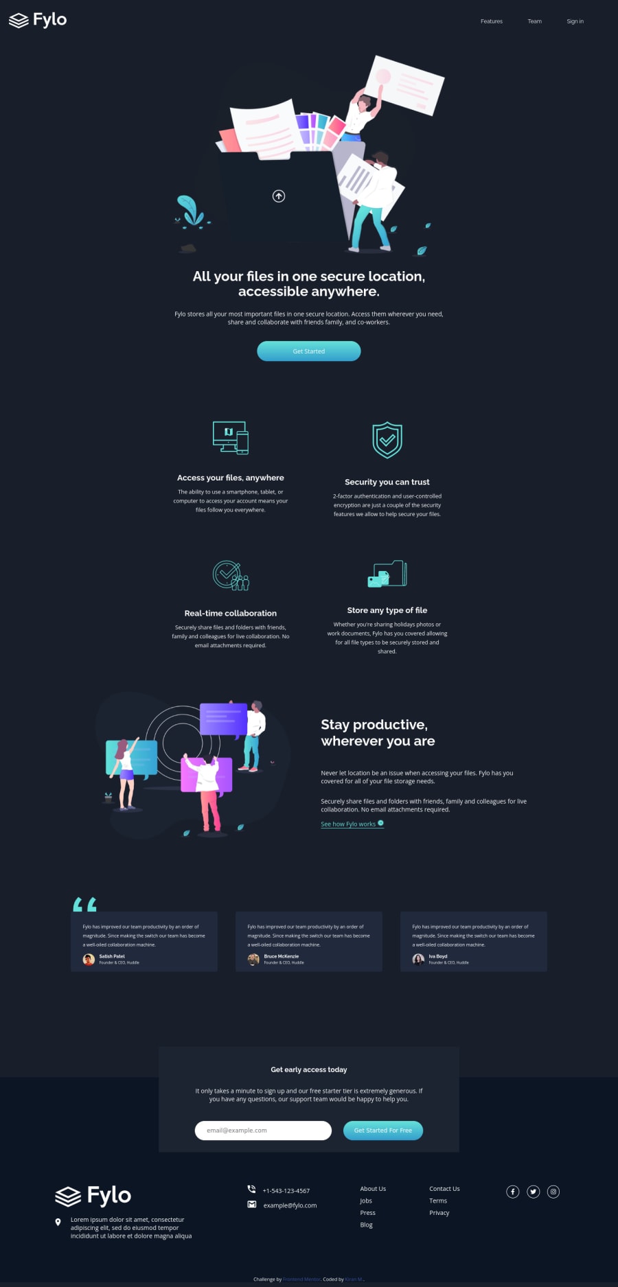
Design comparison
Solution retrospective
Hello Everyone,
Tried to make this using semantic Html for the first time and hoping it'll be more accessible to screen reader users. But you feedback/comments will be highly appreciated to help me improve further. I couldn't get the custom email validation error message right using just html and CSS, guess bit Javascript was needed for that, however I stuck with Html and Css as per the challenge.
Community feedback
- @1ZapienPosted about 3 years ago
Hello Kiran, since you are working on accessibility you should add aria labels to your media links.
For example: <a href="" aria-label="Twitter"><i class="fab fa-twitter"></i></a>
This will add a label/context to your link which will be used by screen readers.
You can look into Aria here. Just use them when there are no semantic tags in HTML though.
0@K-MannnnPosted about 3 years ago@1Zapien Hi Juan,
Thanks for leaving feedback. You have answered few of my questions regarding use of aria labels, I was a bit confused as I see people using them with semantic mark up and the docs suggest otherwise. But I'll improve on the accessibility further in upcoming projects. Thanks again, its very helpful.
1@1ZapienPosted about 3 years ago@K-Mannnn yea some people add them to semantic html but that will override the default ARIA semantics.
0
Please log in to post a comment
Log in with GitHubJoin our Discord community
Join thousands of Frontend Mentor community members taking the challenges, sharing resources, helping each other, and chatting about all things front-end!
Join our Discord