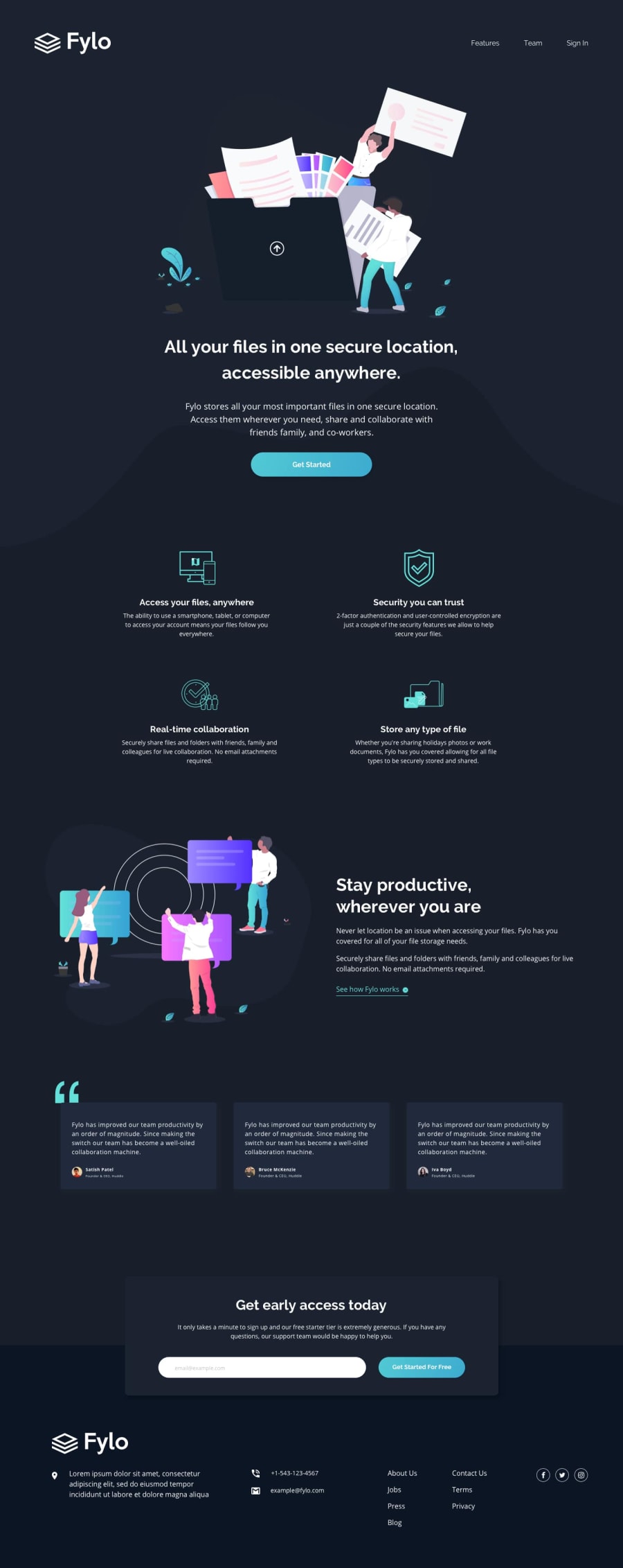
Design comparison
Solution retrospective
All feedback is welcome thank you in advance.
Community feedback
- @visualdennissPosted over 1 year ago
Hey there,
congrats on completing the challenge successfully! Your submission looks pretty nice overall
To improve user experience, I'd suggest adding a background-color change on hover on the button. E.g.
button:hover { background: a-darker-tone-you-like; }, also u can add a smooth transition effect with button {transition: background .4s ease;} if you prefer.
Also the paragraph text in the section between the grid and testimonials seems to be too widely spread, a long line, on a wide screens. So i'd suggest try to limit its width for better user experience and readability. Here is a great resource: https://baymard.com/blog/line-length-readability
Hope you find this feedback helpful!
Marked as helpful0
Please log in to post a comment
Log in with GitHubJoin our Discord community
Join thousands of Frontend Mentor community members taking the challenges, sharing resources, helping each other, and chatting about all things front-end!
Join our Discord
