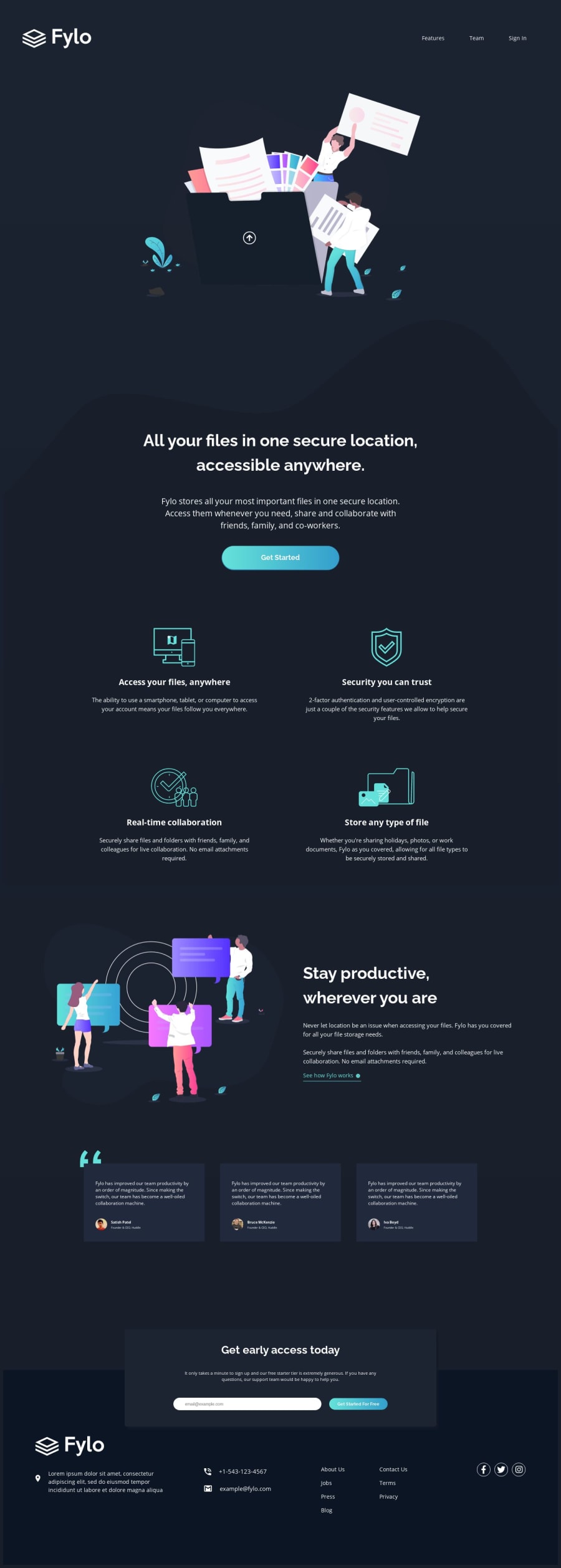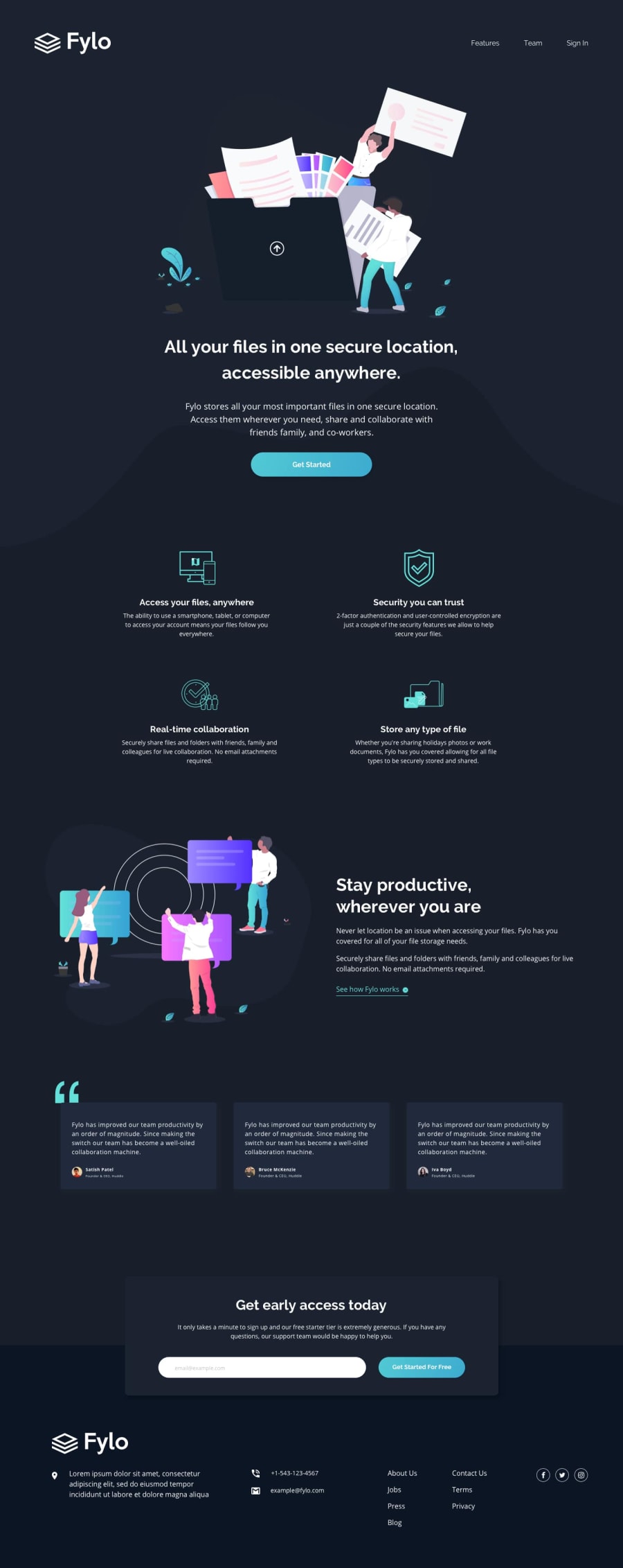
Fylo dark theme landing page CSS Grid and Flexbox
Design comparison
Solution retrospective
I had a bit of trouble with positioning the background image so any guidance on that (or any other constructive thoughts) are more than welcome!
Media queries are foreign to me so this one doesn't have one yet. If anyone has guidance on sizing for different screens I would VERY much appreciate it! :)
Updated to do media queries 9/14.
Any feedback still welcome!
Community feedback
- @markup-mitchellPosted about 4 years ago
Hi @hammercait! I think media queries are one of those things that seems totally baffling... until the penny drops and then you wonder why you found it so hard (like every new coding concept 😅). I struggled with them, and even now I only use them in a very minimal way.
You can think of them as conditional statements for CSS:
@media (min-width: 768px) { body { background-color: red; }; }means "if (viewport is 768px or more) then apply style (
body { background: red})"I suggest you only use
min-widthuntil you really need something else (I rarely do).This goes hand-in-hand with the "mobile first" approach because it's easier/better, for various reasons, to implement mobile-friendly designs first, then expand them to work on tablet and desktop.
Try starting your next challenge with the mobile design: develop it in devtools with the device emulator set to iPhone6/7/8 (or 375px). When the mobile version is finished you can start adding media queries to realise the desktop (or tablet) design.
1
Please log in to post a comment
Log in with GitHubJoin our Discord community
Join thousands of Frontend Mentor community members taking the challenges, sharing resources, helping each other, and chatting about all things front-end!
Join our Discord
