Design comparison
SolutionDesign
Solution retrospective
Fylo Dark Theme Landing Page
Community feedback
- @Tryt4nPosted almost 2 years ago
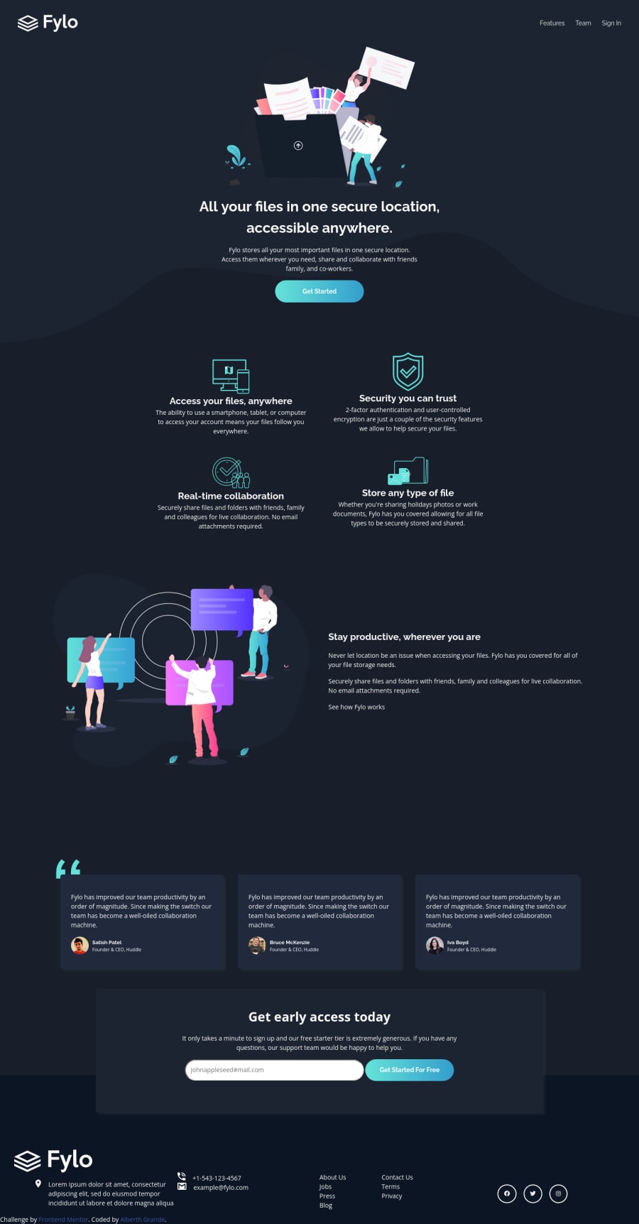
Your button on hover state overlaps on input email. Also in footer lorem text have additional margin top and bottom and it's look weird. You could also add padding left and right to your footer section because in width < 1300px content is on the edge. The same with your testimonials section. On hover state in mobile it's on the edge.
0
Please log in to post a comment
Log in with GitHubJoin our Discord community
Join thousands of Frontend Mentor community members taking the challenges, sharing resources, helping each other, and chatting about all things front-end!
Join our Discord
