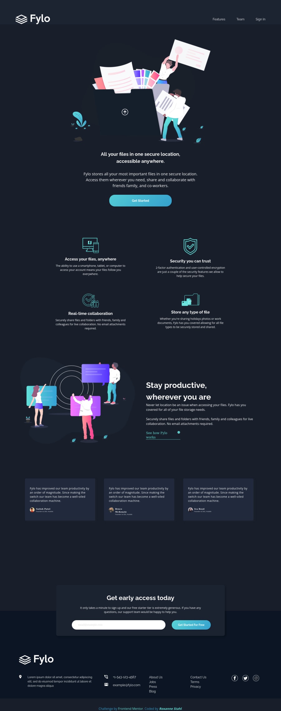
Design comparison
Solution retrospective
I did most of the Newbie Challenges and decided to take on a Junior Challenge (my first). Let me know what you think! As always, I appreciate all feedback and critiques. Thank you!
Community feedback
- @VCaramesPosted about 2 years ago
Hey there! 👋 Here are some suggestions to help improve your code:
- The nav links should be created using an
unordered list
.
- The “illustrations/icons” serve no other purpose then to be decorative; They add no value. Their
alt tag
should left blank and have anaria-hidden=“true”
to hides it from assistive technology.
More Info:📚
https://www.w3.org/WAI/tutorials/images/
- The first button (on top) should be created using an
anchor tag
, since it should directed users to a "sign up" page.
- The "Access your files, anywhere" and other features, should be an
h3
heading, but ensure that all rules are followed, you will want to include ansr-only
h2
heading at the beginning of the section.
- To improve the semantics of your component, you want to wrap the testimonial component in a
figure
element, the author’s information should be wrapped in afigcaption
element and lastly, the testimonial itself should be wrapped in ablockquote
element.
Code:
<figure> <figcaption></figcaption> <blockquote></blockquote> </figure>
More Info:📚
- The
footer
phone and email are not part of thenav
they should be outside of it. Only the links should be there.
- The link should be one list, not two; you can use the
column
property to style it.
- Remove the keyword "icon" from the social media icons
alt tag
description; not needed.
- Attribution should be inside the
footer
element.
- Implement a Mobile First approach 📱 > 🖥
With mobile devices being the predominant way that people view websites/content. It is more crucial than ever to ensure that your website/content looks presentable on all mobile devices. To achieve this, you start building your website/content for smaller screen first and then adjust your content for larger screens.
If you have any questions or need further clarification, feel free to reach out to me.
Happy Coding! 🍂🦃
0 - The nav links should be created using an
Please log in to post a comment
Log in with GitHubJoin our Discord community
Join thousands of Frontend Mentor community members taking the challenges, sharing resources, helping each other, and chatting about all things front-end!
Join our Discord