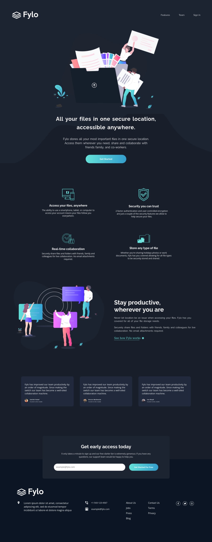
Fylo dark theme landing page
Design comparison
Solution retrospective
Hello, Frontend Mentor community! This is my solution to the Fylo dark theme landing page.
I appreciate all the feedback you left that helped me to improve this project. Due to the fact that I published this project very long ago, I am no longer updating it and changing its status to Public Archive on my Github.
You are free to download or use the code for reference in your projects, but I no longer update it or accept any feedback.
Thank you
Community feedback
- @Abdurehman420Posted over 2 years ago
Great job !!! keep it up
P.S : I was wondering if you use Instagram
3@catherineisonlinePosted over 2 years ago@Abdurehman420 Thank you! Yes I am, it's @catherineisonline
0 - @christopher-adolphePosted over 2 years ago
Hi Catherine!
I had a look at the code from your github repo for this challenge. Your markup and styles are neat.👌 Even if you are using plain
css
you have added comments which makes it easy to access rules sections.On the overall, you did a great job for this challenge. Below are a few things that I have noticed you could improve in your solution.
Desktop:
- The background of the
<header>
and that of the<article class="intro-text">
are chopped on wide viewports (starting at around 1200px) and the two column layout of<article class="section-two">
also looks too far appart. You could easily solve this by applying amax-with
to the<article>
that define the sections of your content and this will rectify the overall spacing on wider viewports. - In
<article class="section-two">
, the link "See how Fylo works" is not picking the right font-family. I think aclass="rale"
is missing on that anchor element. - In
<article class="section-three">
, the decorative quote is missing. - In
<article class="section-four,">
, the form control error message alignment is a bit off on wide viewports and it is also not picking the right font-family. Maybe you should consider adding a wrapper to the form control so that the error message stays align with the it, like this:
<div class="input-section flex-container"> <form> <div class="input-group"> <input class="input-field" type="text" placeholder="[email protected]"> <p class="rale error-msg">err</p> </div> <div class="input-group"> <button class="rale email-btn">Get Started For Free</button> </div> </form> </div>
Mobile:
- The spacing between the navigation links should be reduced.
- The illustrations are looking quite smaller and the content squeezed as compared to the design. In fact, in the design for mobile, only the testimonial section looks narrower while the rest of the content seem to have a spacing of around
50px
on each side. In your solution it is kind of the opposite. 😉 - On smaller viewports (e.g Iphone SE) the form is overlapping over the content of the footer such that we can't see the logo and read part of the address. The phone details are also squeezed.
I am curious to know how you managed to get the screenshot preview of your solution so close to the design ? 🤔 When I submitted my first solution on FrontendMentor a few days ago, I literally got a blank preview because I added an animation in the hero section. I fixed that but the next preview still different from the design preview. 😝
Keep it up! 👍
1@catherineisonlinePosted over 2 years ago@christopher-adolphe Thanks for the feedback, I will go through it. As for the design, I am using Figma and Chrome extension Perfect Pixel
1@christopher-adolphePosted over 2 years agoHi @catherineisonline,
I'm happy to help 🙂.
Yeah, I started using the Perfect Pixel Chrome extension. It's indeed a great tool to get as close as possible to the design. 👍
Cheers
0 - The background of the
- @EmmanuelHexerPosted over 2 years ago
Wow, good job. i want to ask what you use to make your design exactly like the original one, I mean in measurements and everything?
1@catherineisonlinePosted over 2 years ago@Phalcin Thank you. I am using Figma and Chrome extension called Pixel Perfect
0 - @AndyAshleyPosted over 2 years ago
Awesome Job on the challenge! It looks/functions great! One thing you might want to do is add a max width on sections 2 and 3 after 1440px. On 2K screens and up the content inside looks a little farther apart. Everything else flows nicely and is spaced perfectly. Overall great job and happy coding!
0@catherineisonlinePosted over 2 years ago@AndyAshley Thanks for the feedback!
0 - @Muralidhar22Posted over 2 years ago
Hey catherine,
- On mobile view, illustration intro img in the background you can try media query for mobile screen and set
background-size: 90%
andbackground-position: top 50% center
- The curvy bg is a tricky one, which I faced issues while styling it,so i gave the "illustration intro img" directly in the html and curvy bg in the background by creating a intro div,so you can try to insert your "illustration img" into your
class=intro-text
and set the "curvy bg" in theintro-text
class and keep adjusting with media queries - avoid giving heights to icons
- better use grid box in the footer to style all section,flex box is recommended for one-directional layout
- social icons are getting out of the footer-inner in the screen-size: 900px-1100px.
- copyright text is missing.
- you can change
font-size
withmax
function example:max(1.6rem,2.6vw)
0@catherineisonlinePosted over 2 years ago@Muralidhar22 Thanks for the advice. Quick question, why do I need copyright text here?
0@Muralidhar22Posted over 2 years ago@catherineisonline nvm, guess i confused this with other challenge
0 - On mobile view, illustration intro img in the background you can try media query for mobile screen and set
- @Patilsahil821Posted over 2 years ago
Wow very perfect and crystal clear good job mam...
0
Please log in to post a comment
Log in with GitHubJoin our Discord community
Join thousands of Frontend Mentor community members taking the challenges, sharing resources, helping each other, and chatting about all things front-end!
Join our Discord