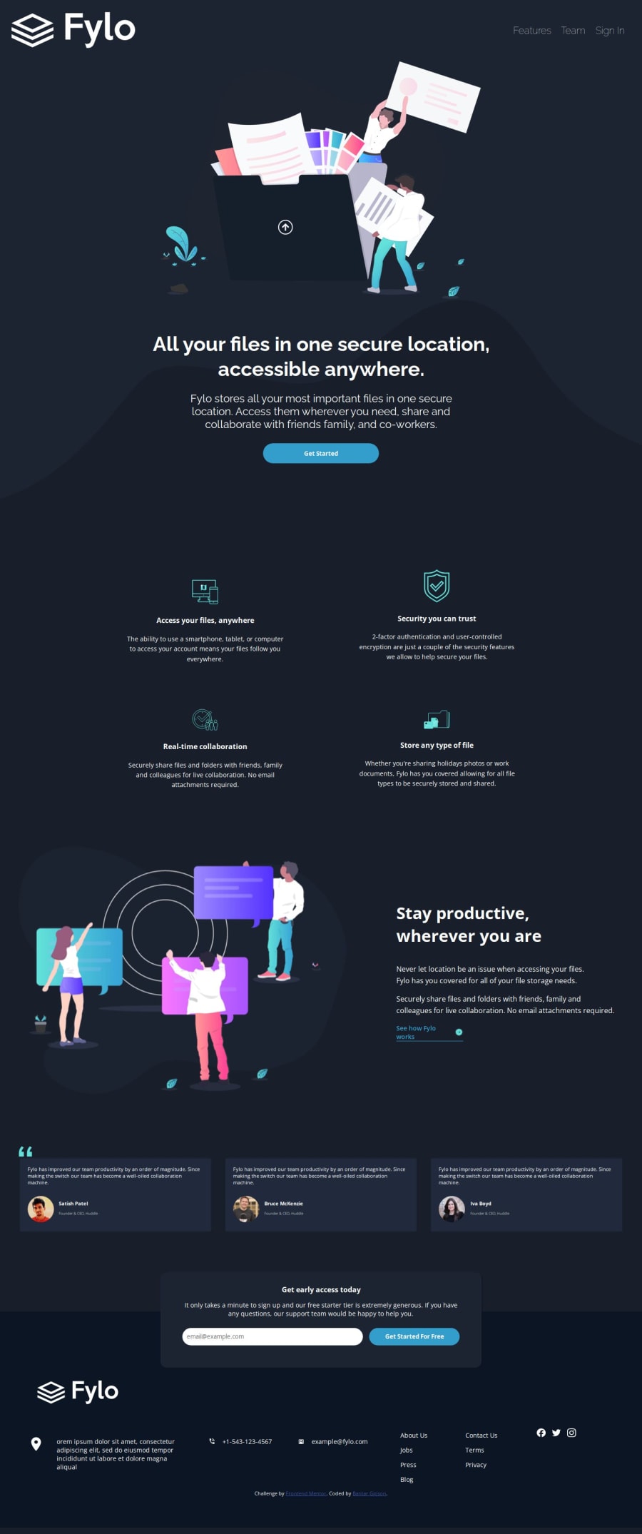
Design comparison
Solution retrospective
i am happy about the challenge i had to learn new css properties which i don't often use but at the end i did complete the challenge. and i had difficulties in making good use of the grid around the section section of my site and i will try to complete this task again and i will make good use of the grid layout better
What challenges did you encounter, and how did you overcome them?making use of the grid and i did overcome this by going through a video of Kevin powell on grid layout
What specific areas of your project would you like help with?I will need help at the footer section, the desktop version and the card section and i will need to learn more about responsive layout and how make good use of it. And also on how to change colors of icons
Community feedback
- @dev-paulLPosted 4 months ago
Hi 👋 Great job on completing the challenge!
I noticed a few typos in your HTML and CSS, such as some unclosed tags and undefined CSS properties. It's a good practice to review your code multiple times before submitting.
You might also consider using semantic HTML tags like
<main>,<section>,<blockquote>,<article>, and<address>in this challenge. Additionally, it's important to providehrefattributes for links so they can receive focus, andaltattributes for images.For the icons, you can use
<svg>instead of<img>, which allows you to easily change the fill color on hover using CSS.Keep up the good work!
Marked as helpful0@GipsZ1Posted 4 months ago@dev-paulL Thank you for your review and I will do my best and try to apply all what you said
1
Please log in to post a comment
Log in with GitHubJoin our Discord community
Join thousands of Frontend Mentor community members taking the challenges, sharing resources, helping each other, and chatting about all things front-end!
Join our Discord
