
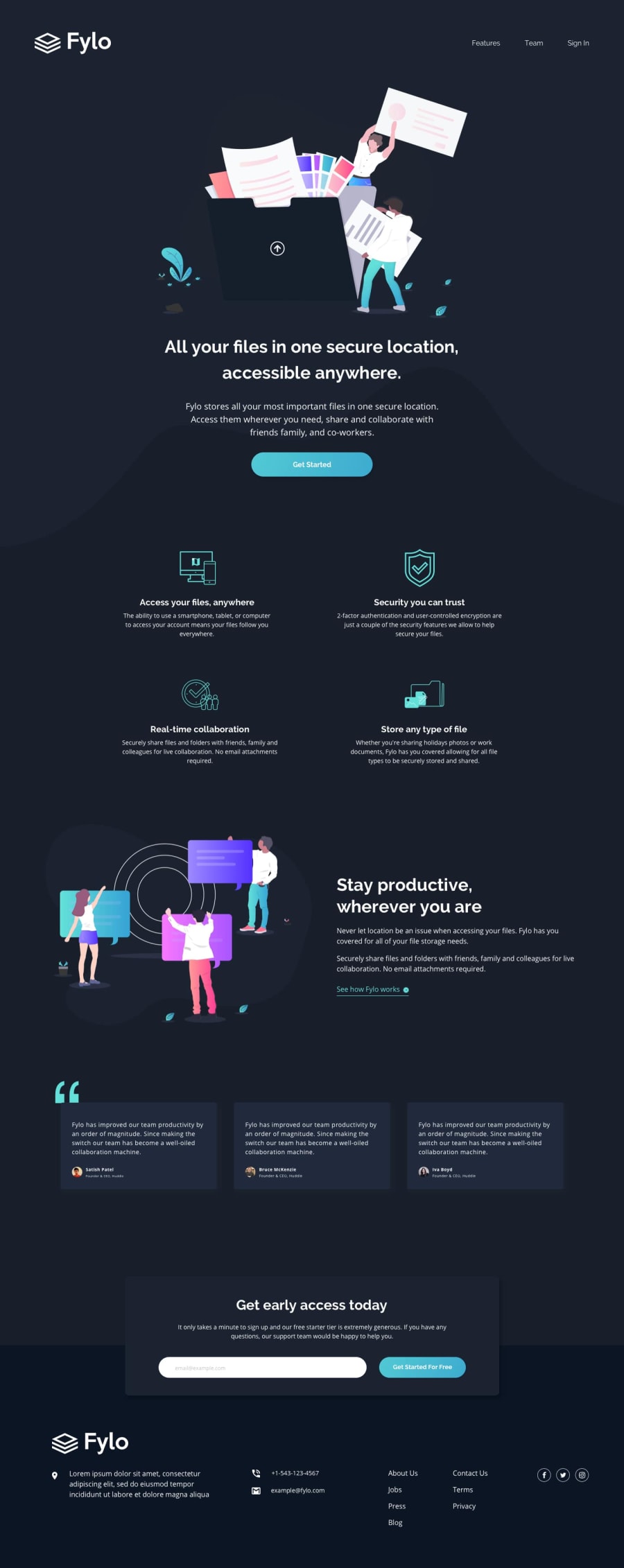
Fylo Dark Landing Page - Flexbox, Mobile-First


Design comparison
Solution retrospective
This one took me far longer than I originally thought it would, and I definitely should have used Sass - next time! Also first time experimenting with inline svg, which I enjoyed.
If anyone knows of an easier way to get the top mobile background image to match the design other than my weird linear-gradient and positioning nonsense (used for phone screens only, not the tablet resize), please let me know! I feel like there’s probably an obvious answer, but I’ve been staring at the issue too long to see it.
On the same note, has anyone managed a “pixel-perfect” solution of the desktop four icon features section without using a ton of micro-adjustments? I tried to do it as simply as I could, but trying to get it to match perfectly made me feel like I was slowly going mad.
If you see anything else or have any other suggestions, please let me know!
Community feedback
Please log in to post a comment
Log in with GitHub
Join our Discord community
Join thousands of Frontend Mentor community members taking the challenges, sharing resources, helping each other, and chatting about all things front-end!
Join our Discord