Design comparison
Solution retrospective
This was a fun project but I did have 2 questions, if anyone could help:
-
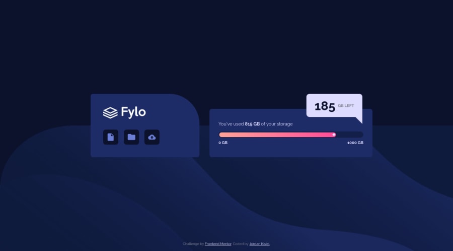
I tried using a <meter> for the storage display to be more semantic but it seemed resistant to styling. I tried using appearance: none but then I wasn't able to get the meter foreground to show up. Is it possible to style the meter element to make it look like the design in this case?
-
To create the speech bubble effect where it says "185 GB LEFT", I used the css trick of utilizing large borders to create a triangle. While this solution works, it does feel a little hacky. Is there a more modern best practice for this sort of effect?
Community feedback
Please log in to post a comment
Log in with GitHubJoin our Discord community
Join thousands of Frontend Mentor community members taking the challenges, sharing resources, helping each other, and chatting about all things front-end!
Join our Discord
