Design comparison
Solution retrospective
Hi all,
this was a fun one!
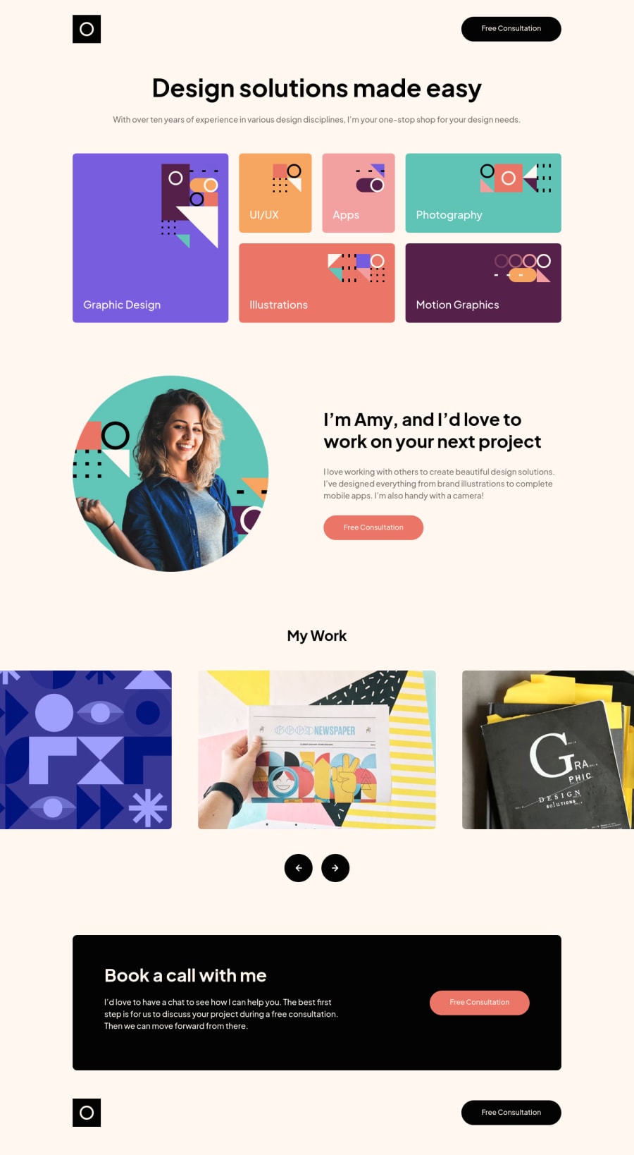
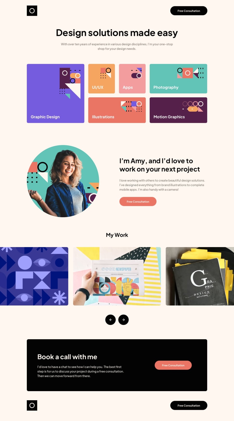
Getting everyday practice with challenges like this really up your game a lot. I learned a bit like always but having some tough time with grid especially placing the Photography/Illustrations items on the grid like in design. Those of you who managed to complete this challenge will know what i'm talking about.
I really wanted to test myself in getting design without media queries but i finally decided to stop fighting and place some here and there. Probably could have done without it but switching text alignment is something i still need to learn without media queries. As far as i know this is not possible.
Anyhow looking forward to see your comments, probably the thing that i'm interested the most is markup for "Services" grid on the top of the page. Would it be possible to do it without extra markup for the middle column? I tried everything i can think of and was always one step away from the solution.
Also couldn't think of a better way to offset the image on the Tablet "breakpoint" so i used position:absolute to inherit height of the parent element and just align it to the right basically and let it overflow outside of the window.
Keep coding!
Cheers, Miran
Community feedback
Please log in to post a comment
Log in with GitHubJoin our Discord community
Join thousands of Frontend Mentor community members taking the challenges, sharing resources, helping each other, and chatting about all things front-end!
Join our Discord
