Submitted over 3 years ago
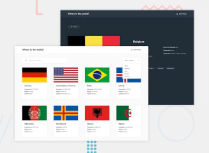
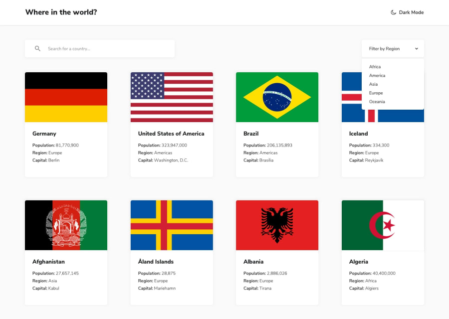
Fully responsive with React and Styled Components
@maciekw129
Design comparison
SolutionDesign
Solution retrospective
That's my first such big React project. I will be grateful for any suggestions and feedback ;)
Community feedback
- @ixtkPosted over 3 years ago
Looks good.
I would go from 1 to 2 columns instead of 3 right away. You should really add
alttexts for images as the report suggests.0
Please log in to post a comment
Log in with GitHubJoin our Discord community
Join thousands of Frontend Mentor community members taking the challenges, sharing resources, helping each other, and chatting about all things front-end!
Join our Discord
