Fully Responsive Website Development using HTML/CSS and a bit of JS
Design comparison
Solution retrospective
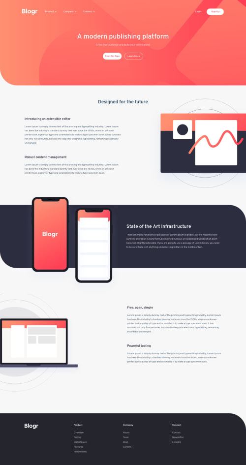
It was a fun and quite easy challenge for me. However, there are some parts where I struggled a bit. I'm firstly looking for an overall and honest opinion from you and if you can suggest me something I could/should improve. I've had hard time trying to make those grid and background image assets responsive so If anyone has a good idea or solution, please share. I've tried to use width, height and position of images in percentage or vh/vw but it didn't turn out to work as I expected.
Community feedback
- @ChamuMutezvaPosted over 3 years ago
Great work indeed. Well done. The mobile and desktop view is awesome.
- take another look on medium devices from about 465px screen size - the navigation does not present well , some elements are sitting on top of others.
- img must have alt text for accessibility.
- i noted that the nav has been repeated twice (with one dedicated for mobile) - my opinion is to have one navigation that you can display and move around with css
happy coding
0@thedev966Posted over 3 years ago@ChamuMutezva Hey, thanks for your suggestions! Yeah, I know I need to add another breakpoint for medium sized devices to fix that overflow problem with my navigation. I have probably forgot to add alt to my images, but I know in production based websites, it is mandatory to include that as well. Actually, I had a plan to keep only one navigation and only customize it with media queries for mobile phone screens but there was a problem. On mobile phone screens, header changes drastically and I thought it would be easier to make a separate navigation for only mobile phones. Maybe, it is not a perfect way to do it but it worked well even though I personally always try to reuse the same code over repetition.
0 - @pikapikamartPosted over 3 years ago
Great work. Your overall layout in the desktop view is pretty good, but the point where you redesign the layout is very much late since your breakpoint is at 380px I guess width, but at that point, your components is now squished or being overlapped by one another. A good Idea would be to add another breakpoint where the layout starts to make the elements overlaps one another. Your grid, well it seems they do what they need and since you're using
fr
it resizes well ^0@thedev966Posted over 3 years ago@pikamart Yes, I know. I mentioned that in the readme file on the github repo. From 800px till 395px there is no breakpoint, that's why my navigation gets squished and overflowed. I will probably update my css file and add at least one more breakpoint to fix that. Thanks!
0 - @jorgeflagelPosted over 3 years ago
Hi, good job! It looks nice.
For the problem with the images, maybe you can add
display: none
in thediv
that contains the image for desktop screens and use thebackground-image
property on the divs.firstFeatures
,secondFeatures
, ...With
background-position
andbackground-size
you can position the background-image in the right place.This is the way I solve these kinds of problems. Hope this can help you.
0@thedev966Posted over 3 years ago@jorgeflagel Thank you for your kind words. I could have used "srcset" attribute for img tag with different image for different device width but of course there is always room for improvement. Yeah, I used background size / position in one of my images, I think.
0
Please log in to post a comment
Log in with GitHubJoin our Discord community
Join thousands of Frontend Mentor community members taking the challenges, sharing resources, helping each other, and chatting about all things front-end!
Join our Discord