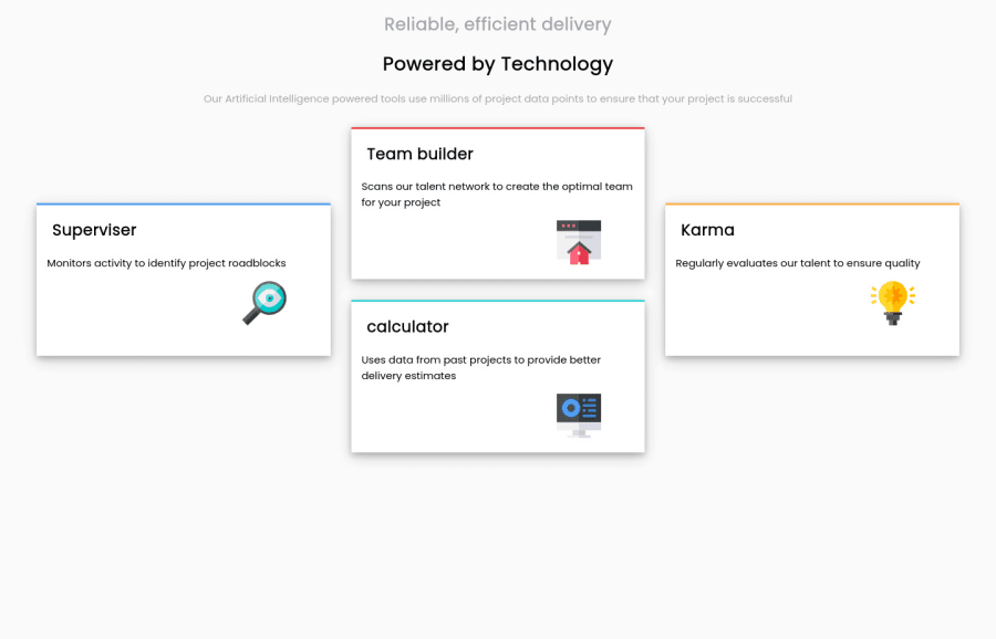
Design comparison
SolutionDesign
Solution retrospective
Any feedbacks or suggestions would be great thanks!
Community feedback
- P@kens-visualsPosted over 3 years ago
Hey @Theguydev 👋🏻
I have some suggestions to help you fix the accessibility issues and some other things.
- In your markup,
<div class="container">...</div>should be<main class="container">...</main>and<div class="header-container">...</div>should be<header class="header-container">...</header>. These will fix the accessibility issues. Don't forget to generate a new repot once you fix the issues. - For the icons, add
aria-hidden="true”, because they are for decoration. You can read more aboutaria-hiddenhere. For example:
<img src="assets/icon-supervisor.svg" alt="" aria-hidden="true”>- Next,
<p class="main">...</p>should havetext-align: center;, especially on mobile viewport width. - I won't go into many details about resetting CSS, but I'll leave this cool article here, which will make more sense than my brief explanation.
I hope this was helpful 👨🏻💻 all in all, you did a good job with the project, keep it up. Cheers 👾
Marked as helpful1 - In your markup,
Please log in to post a comment
Log in with GitHubJoin our Discord community
Join thousands of Frontend Mentor community members taking the challenges, sharing resources, helping each other, and chatting about all things front-end!
Join our Discord
