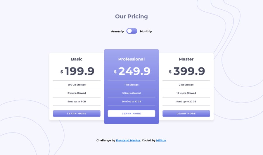
Fully responsive project using Vanilla Javascript
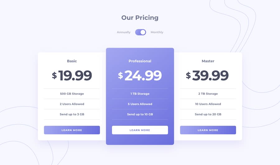
Design comparison
Solution retrospective
Feedback and criticisms are highly appreciated
Community feedback
- @grace-snowPosted over 4 years ago
Hi, Looking on mobile the titles like basic, professional etc are way bigger than the design. (The word professional even spills off the side of my phonr screen at the moment) In the design they are a lot smaller though so it should be easy to fix all
0@grace-snowPosted over 4 years agoCurious - Are you trying to use BEM for naming or just writing your own style of class names?
The way you've used classes is 👍 👍 It's just an unusual naming convention having lots of double underlines inside class names, so I was wondering why/where you've got that from.
0@grace-snowPosted over 4 years agoOne more: your toggle switch isn't valid html or accessible at the moment. As raised in your report, the input needs an ID and the label text should then link to that I'd in its 'for'.
The problem with using a checkbox for this toggle is that a checkbox indicates an on-off switch. It's hard (not impossible) to make the labels work when there is two of them. Really the only label on this input should be its 'checked state' - so if that equates to monthly, that word should be the label, the other word should be hidden or a completely hidden label for assistive tech could be used. Or you could use hidden extra words like (active) to indicate state to assistive tech.
For me, when there are two labels it makes more sense to use radio buttons so users are making a clear choice between the options.a checkbox will always need extra work to make it accessible in this context
0@MilitusInnocentPosted over 4 years ago@grace-snow yes, I use BEM in all my naming. I've been using it for a while now and I think I got used to it. Let me quickly fix the mobile. Thanks for the input!
0@MilitusInnocentPosted over 4 years ago@grace-snow Hello Grace, I have fixed everything. You can look again to be sure I got it right this time. Thank you so much for pointing it all out, I really appreciate.
0@grace-snowPosted over 4 years agoHi @MilitusInnocent, My question was actually because it looks like you're not using BEM at the moment.
BEM cant have two lots of double-underlines, only ever one. What you've got at the moment is Block__Element__Element rather than Block__Element--Modifier.
It's fine to set yourself a new convention but it's non standard so looks like a mistake at the moment. In job applications it's the kind of thing I would ask about and expect a clear reasoning as to why this particular naming convention was used - if there is a clear explanation, that's great. But if they said it was BEM it would raise a flag.
Maybe revisit how to write BEM-naming again to make sure you fully get what it's aiming to do
0@grace-snowPosted over 4 years agoWith the toggle, it still wouldn't be accessible as it stands I'm afraid. This is bacause of using multiple labels. I'd need to check exactly how it's working with my screenreader, but if there are 3 labels on an input, I don't think that will make it any clearer what equates to "checkbox checked" and what equates to "checkbox unchecked" - How will I know which label is for each state?
Does that make a bit more sense?
These are the kinds of things professional front end developers have to solve all the time, so it's good to spend time figuring it out now ☺
0@MilitusInnocentPosted over 4 years ago@grace-snow lol I'm totally new to all of this. I guess I need a lot more work done. Thank you. Are you like a tech lead or something?
0@grace-snowPosted over 4 years agoWe're all learning all the time, that's what makes this platform so great ☺
And I was a senior designer and a frontend developer for years at a software scale-up; then did frontend for an e-commerce big corporate; now doing pure front end at an agency. I'm more mid than senior when it comes to front end, but have a specialism in accessibility
0@MilitusInnocentPosted over 4 years ago@grace-snow I will say you are still senior lol
0 - @abhik-bPosted over 4 years ago
Hi Militus , Your solution seems to be amazing and
- it is very responsive which is great
- for the cta buttons in the pricing cards you can set the border to
1px solid transparentand then on hovering give it aborder-colorthis way it will look even nicer and the card's height won't change
Good job , Keep it up 💯
0@MilitusInnocentPosted over 4 years ago@abhik-b thanks a lot Abhik! I will look at it right away
1
Please log in to post a comment
Log in with GitHubJoin our Discord community
Join thousands of Frontend Mentor community members taking the challenges, sharing resources, helping each other, and chatting about all things front-end!
Join our Discord
