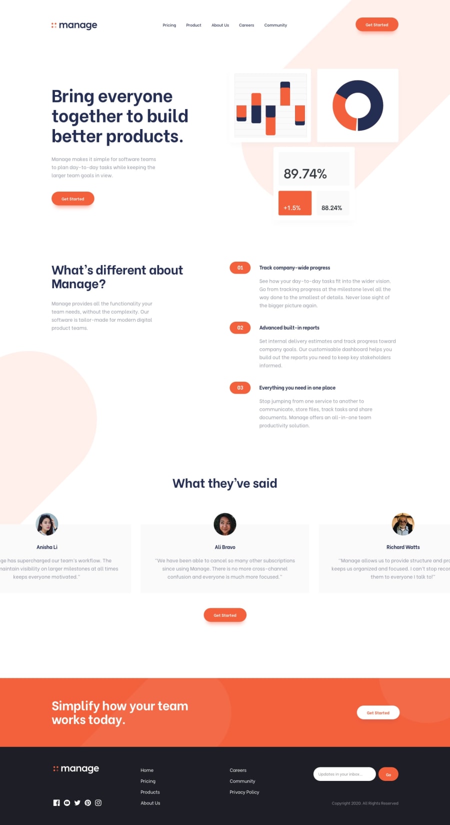
Fully Responsive Landing Page | React | Webpack | Sass | Contexts
Design comparison
Solution retrospective
Please provide your feedback as it'll help me tackle my future projects in a better way!
Community feedback
- @LaplaceXDPosted over 4 years ago
Hello Sapinder, good job on this challenge, although some minor adjustments (like spacing) could do some work. Your solution looks stunning and well made.
For some suggestions in the code, I can only comment on the Sass part, since I have yet to lean ReactJS. I see that you've been using the nesting feature of sass, while generally a great feature as people have proclaimed it to be, you should try to stick to at least 3 levels deep of nesting, any more than that, and it's basically nest abuse (as others call it 🤣). And another thing to note would be to avoid nesting classes, or elements together, as it would generate a higher specificity, and the project would be harder to maintain as it grows bigger. You could use a methodology like BEM, and the 7:1 pattern (since it focuses on components like React) to minimize nesting and generally make your work more scalable.
These are all the suggestions I could make. Anyways, good job on the challenge, you owned it pretty well, cheers!
1 - @sapinder-palPosted over 4 years ago
I appreciate your feedback. I'm thinking to improve upon my usage of sass, however, in this project I spent a great amount of my time in implementing a lot of webpack stuff like-
mini-css-extract-plugin,postcss-loader,autoprefixer, etc., and understanding how everything works. I'm slowly improving my way of working and forgetting my bad practices. I'll try to improve my sass way of working. Could you please elaborate the 'BEM' and '7:1' you said about?0@LaplaceXDPosted over 4 years ago@sapinder-pal BEM is just a naming methodology, which means Block__Element--Modifier.
For example in a the testimonial card you can have:
.testimonialfor the container.testimonial__namefor the name containing elementAnd if you want to have another variation of the name you can have
.testimonial__name--redor if Lucas has a different style for his name, you can do.testimonial__name--lucasWriting this in your sass style sheets, you'll have:
.testimonial {
      &__name {
            &--lucas {}
            &--red {}
      }
}
Which outputs:
.testimonal {}
.testimonial__name {}
.testimonial__name--red {}
.testimonial__name--lucas {}
And as you can see it generates a lower specificity, rather than nesting pure classes which would generate a higher specificity which would make it harder to override existing styles, especially when you're reusing styles in different pages. Yes, you can use !important but it is very hacky and generally try to avoid from it.
The 7:1 pattern, I'd suggest looking into it, since there are some good tutorials and articles about it, especially from open classrooms. It's just a neat way of organizing everything, minimizing unused css, and maintaining a scalable product.
I can't comment on the webpack, since I've just started on that, too 🤣🤣. And it's good to know early on, since it's used for production builds, but can be a bit overkill for smaller projects.
0@sapinder-palPosted over 4 years ago@LaplaceXD I agree that using bundlers for small projects is redundant, but I've using it in my recent projects and been trying to get better at the tools to optimize my websites, which would be beneficial if I need it in near future. Thanks for your help again!
0
Please log in to post a comment
Log in with GitHubJoin our Discord community
Join thousands of Frontend Mentor community members taking the challenges, sharing resources, helping each other, and chatting about all things front-end!
Join our Discord
