
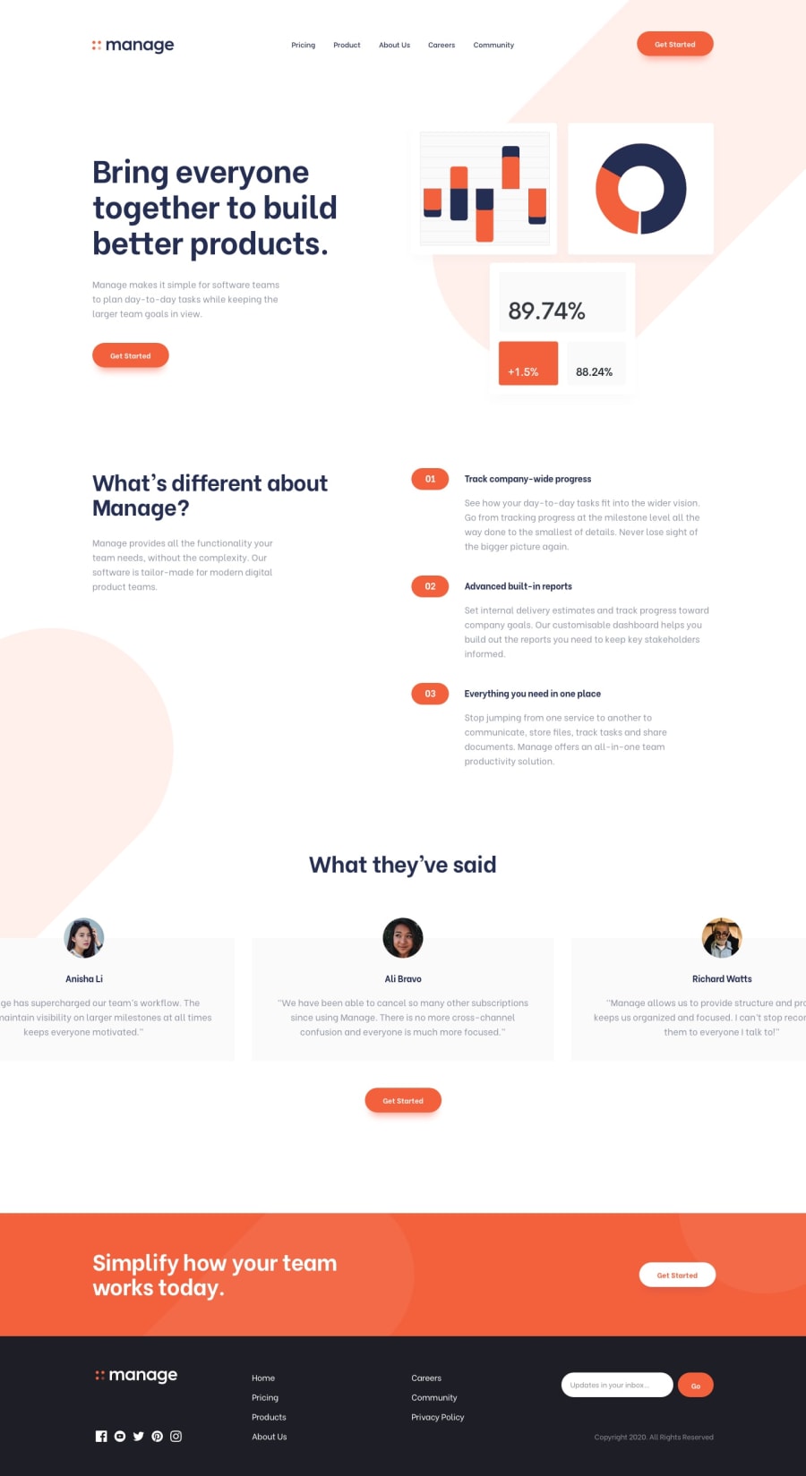
Fully responsive landing page: Next.js / SCSS Modules


Design comparison
Solution retrospective
Hello, thank you for checking out my project.
The main obstacles in this project were svgs. Unfortunately for some reason the recommended plugin (@svgr/webpack) refused to work for me and I decided to use inline svgs. It resulted in some css improvisation to fix alignment problems.
I will be grateful for some good resources related to using svgs in Next.js.
I would also like to make the carousel accessible but at the moment I don't know enough about a11y to do it.
The site also has a very strange horizontal overflow problem on Safari for IOS (checked with a 13-inch ipad). I have hidden overflow on both body and html elements, set max-width to 100vw, but the pill shape in the top right corner appears to be overflowing nonetheless... (strangely enough, the lower one on the left side, doesn't ).
Community feedback
Please log in to post a comment
Log in with GitHub
Join our Discord community
Join thousands of Frontend Mentor community members taking the challenges, sharing resources, helping each other, and chatting about all things front-end!
Join our Discord