Design comparison
Solution retrospective
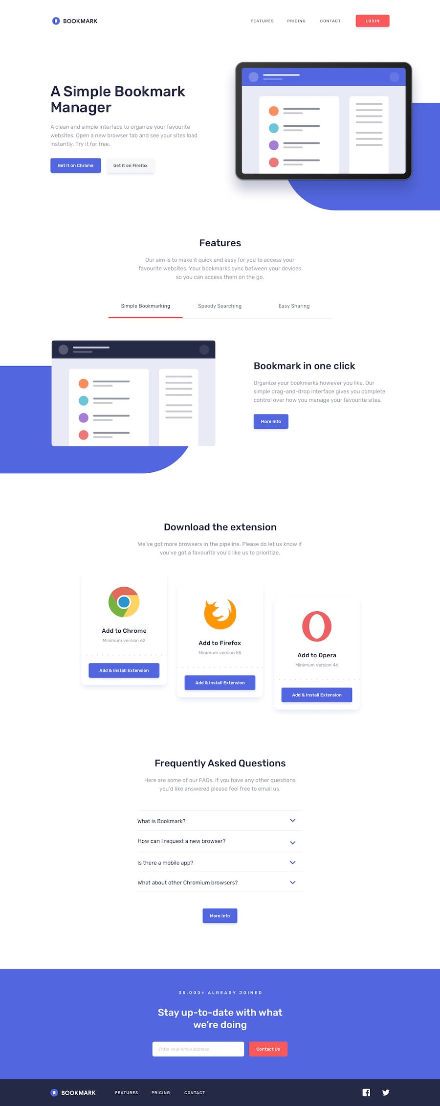
Fully responsive and animated, with smooth scroll and form validation Bookmark Landing Page. Don't hesitate leave some comment about my solution or if you have any questions! :D
Community feedback
- @RocTanweerPosted over 3 years ago
Hello 👋 @Sergio
Awesome work 🔥
I like how you added that loading animation and those on hero and features section..!
The keydown(or something similar) that you used to detect the user input in the email form is very interactive.
The scroll animation is very soothing to my eyes 😂
Over all great 👌 work ☺️
Suggestions :
- Your contact link in footer in softRed color, you might have put that by mistake
- I am on mobile, so I'm not sure, but I feel like you forgot about keyboard users... Like can they navigate with their keyboard on your website? Please check this out...
That's all..!
I have completed this project a couple of days ago 😊, please leave some feedback there if you like..!
Hope it helps and happy coding 😉
1 - @Sergio0831Posted over 3 years ago
Hi Rock, Thank you for your feedback. Contact link in red color because it in active state, when you on contact section. But I think I need to remove links active state. It's no point if nav menu hiding. Yes, you right. I removed standard outline and forgot to apply my custom, like for footer logo. 😉
0
Please log in to post a comment
Log in with GitHubJoin our Discord community
Join thousands of Frontend Mentor community members taking the challenges, sharing resources, helping each other, and chatting about all things front-end!
Join our Discord
